Tuesday, October 31, 2006

Bats in the bedroom

It seemed like an appropriate day to show this. As you can see this is the same room as the picture from Saturday. And you can probably guess that it's Photoshopped too, as was the textured image from that post.

But it's pretty real, all the same. The sunset light pattern in this image was cast by the old float glass in the window, and photographed just to the right of the sink you can see. Sunset doesn't seem like an impossible time for bats.

And all the bats were photographed on the same night last summer, standing out on the porch roof, while they were flying around the bedroom next to this.

It was 2:00 in the morning. I was in the computer room. Suddenly there was a bat swooping from the hall into the bedroom. It had come upstairs from the porch, where a screen was off. Rather than dodge through a hall full of a swooping bat, I thought I'd go out onto the porch roof to open a window to let it out. Unfortunately this brilliant idea meant that the light in the bedroom was still on when I opened the window. So by the time I got back out there with the camera, there were several bats in the bedroom, swooping into the hall and back…

How many can you see? Except for the close-up, all the pictures were taken at the same distance, near the far wall of the larger room, as you can tell by the shadows. And how many species do you think? Three at least…

Labels: , , , , ,

Monday, October 30, 2006

You never know who someone is in their secret life

I never *got* Halloween. From my medievalist years I had lots of costumes, and loved an opportunity to wear them. But they would always ask what I was. "The Snow Queen? Lady Night?" "Huh? I'm just me. Twelfth century, daughter of a country knight. One new outfit a year. It's part of what I do to make the new clothes for everyone in the household." "Huh?"

Then when I worked outdoors in the nursery, after a couple of years of trailing my (washable tourney) hems through the mud, one year I thought I'd wear this. Easy. Everyday clothes, uniform shirt, and my pierced circlet. I was hoping for some double-takes.

One gentleman customer asked me who I was. "Oh, just me. What I wear everyday. You never know who someone is in their secret life." I'm not sure if he had seen the circlet, or not until I walked away. It's even funnier that way.

Everyone is the hero of their own story.

Labels: , ,

Saturday, October 28, 2006

This old house

My grandfather's house, built in 1917 in the Northern California foothills. My mother was born here. Arts & Crafts style simplicity: lath & plaster walls, wood floors, wood baseboards, trim and picture rails. The most flattering paint style is to extend the ceiling off-white down to the picture molding. That way the contrast shows. It's not period to have landlord-white walls. There were many layers of color on them.

There are many built-ins: china cupboard in the breakfast room, buffet in the dining room, large linen cupboard upstairs, small one down. Built-in bookcases besides the fireplaces. Porches: screened dining/living room porch, sleeping porches, entry porches, a balcony upstairs.

Many "places", individually planned & built spots with character: the top floor window seat, the schoolroom toybox/window seat and flanking bookcases. This room has a toybox/seat, and in the closet, a small door that goes back in under the eaves to a private playroom. (well, extra storage, if you're a grown-up) Under the stairs, which was the telephone closet originally, are two small doors, going back further in. It feels friendly when you walk in the door, although everybody turns the wrong way trying to go somewhere, for the first 6 months.

There's a basement apartment my grandfather made when he was 80. Shored up the foundations and poured new concrete floors. Well, he had been a mining engineer. I've lived here for 25 years, this Constitution Day.

The yukata hanging on the closet door was my sister's. We bought them during a year in Japan, my senior and her freshman year in high school. She's gone now.

The house is about to go up for sale.

Labels: ,

Friday, October 27, 2006

I'm really going to have to make some of these dresses


Well, I really am. This project is finished now, and after making the pictures, and writing about these imaginary dresses (it's a publication design class, not fashion design), I am so invested in the idea I really do have to make some. Work out the patterns, at least. Prove that I can do something so flattering. Use some commercial batik fabric, at first. Make some lined reversible skirts and wrap tops. Get the dress patterns right. Then do some hand batik fabrics for them — or batik the dress just before sewing up the side seams.

In case it isn't legible, my glowing imaginary description reads:

Are You Looking for Something Unique?

Clothesline Compositions designs and creates one-of-a-kind & custom handpainted clothing. We use natural fabrics which are comfortable and washable, and hand-dye, batik, or hand dye-paint the fabric.

We specialize in designs which are timeless, classic and flattering rather than trendy. Our color palettes are unique, and repeatable for custom items.

Our clothes are cut to fit and flatter many different shapes, including larger sizes. They move as you move and are fun to wear. The sleeveless designs are especially good as dancing dresses in warm weather. Some of them are reminiscent of classic styles in old movies.

Our hand-painted and batik designs curl lovingly around your body, flattering and enhancing the feminine shape.

Wear a work of art, & add art to your life.


Do you wonder that I want some of these? Now that I have imagined them, I have to have them.

Labels: , ,

Thursday, October 26, 2006

Color with a Difference

This is an example of the glories of Photoshop. Different blending modes can create these different looks of the same fabric design. (A different method of producing new colorways than I was using when I showed these designs before.) In the case of the second fabric, making more of the leaves show the veins would create a more successful design, I think, with more texture variation.

Labels: ,

Wednesday, October 25, 2006

It's the season when the cat starts sleeping on the bed again


 All summer we're separated. He sleeps in the bathtub, or on the floor. I throw the covers off, and there's a fan in the window pointed at the bed. Then, the nights get cooler, and he's back. It's as if he never left. Purring, kneading… at this season I have plenty of covers to make that ok. Sleeping right next to me. … Aack! He didn't use to lick all over my face to wake me up! Where did that come from? Who has he been hanging out with this summer?

This is Cheesecake. He came from the animal shelter as a kitten. I didn't need any more cats. He was named after the kind of temptation one ought to resist — and doesn't. He might even be a Birman. Long-haired, lilac point, white feet. He was younger when I took this picture, but he's still gorgeous.

And no, I don't choose my bedding colors only to flatter him. They just happen to be some of my favorite colors nowadays…

Labels: , ,

Monday, October 23, 2006

Color Compositions

Below is my comment at Dressaday 10-22-06 (And Shoes), where Erin asked if we had the recommended two or three color wardrobe. Lots of wonderful colorful answers.

This picture is an example of a couple of the color principles I've listed below:
#1—two similar colors fighting with each other rather than working together. The shades of sage and aqua on the dress do, I think, go together well, but it was hard to find the exact shades that would. They are also an example of a potential fade-into-the-wallpaper muted combination.
#5—The red-violet background to the sage-&-aqua dress is an example of the muted complimentary combination, in which the colors brighten each other to our eyes, but the total is still not too bright for those who prefer mixed, muted colors
#1—The background yellow-green and the sage are a definite example of similar colors which really don't work together. In Chevreul's words they "injure" each other.

MinaW said

"I used to have only a few colors — bluegreens especially — in my closet. I also used to be so pale that black, grey, or the brights like orange made me look like a dead fish-belly, so my choices were somewhat limited. (The only sort-of-brights I could wear were very mixed: peach, aqua, violet.)

Then I started dyeing fabric and clothes, and my choices expanded to new favorites I hadn't even known were possible. And I took color theory, and learned how to combine any colors, even previous unfavorites, in ways I liked.

A couple of things I've learned:
1—If your closet only has shades of one or a few colors they don't all go together! Too close shades of the same color can often fight, not enhance each other. This is true of black or grey or white too.
2—Neutrals like gray have color in them too, it's just hard to see what it is. But put two greys next to each other; one might go green, the other red, and you can see what the underlying shade is. (I discovered this working in a carpet store, where a whole houseful of something that turned out to be an unexpected green-gray or pink-grey could be a disaster. (Especially when the couch or wallpaper it was chosen to go with went the other way.)
3—For those who have lots of shades of one or a few colors in your wardrobe, where it might be hard to find a cardigan or jacket that goes with them, go to a complimentary color. When I had mostly blue-greens, and started branching out, a muted purple or red-violet went with everything in the closet.
4—Don't stress about not knowing the color wheel and what's a complimentary color. The color wheels are all wrong anyway. Use your eyes; choose a contrast you like the look of.
5—If like me, you tend to prefer somewhat muted colors, and worry that you fade into the wallpaper… you may be very pleased with the muted-contrast combination. Choose your favorite muted color. Now go to an approximately opposite color, and choose a muted version you like. The two, being sort-of opposites, will make each other brighter to the eye, and yet not be so bright they scare you.
6—A trick from quilting: choose prints which contain colors you like to wear together. Then it suggests a whole bunch of combinations, and goes with lots of your clothes. Just don't make the corollary quilter's error and get too boring by being monochrome (all shades of one color) with no contrast.
7—The stategy of having neutrals in skirts, and colors in tops, like someone mentioned, can make bringing in colors easy. As a roommate & I discovered long ago, a flattering neutral can be a duller version of your hair color.
8—The idea of a key piece of jewelry or garment like a patterned skirt or decorated jacket, with a collection of colors you like, is a great way to tie an outfit, a wardrobe, or a suitcase-full of clothes together." (India & Oracle mentioned this strategy)

9—And the one I didn't say there, 'cause it seemed to be getting into too much color theory, is that all colors with similar amounts of grey in them go together, but it's much trickier to put them with colors with different amounts:
A—Pastels all go together, and white is the neutral that goes with them. Grey and black make the pastels look washed out. So do brights.
B—The rich jewel tones go together, and work with black beautifully. They shine against it. This includes gold.
C—The pure color-wheel colors go together, and they work with black or white. These are very bright combinations. For a little more harmony, use fewer of them: blue & yellow. And/or use related ones: orange & red or blue & purple. Also, using white with them, like using white flowers in a garden, can tone down some of these blinding combinations.
D—The muted, mixed colors go together, and will work well with greys. Use the opposites or near-compliments together to avoid too dull an effect.

And the one that only Chevreul, of all the color theorists, mentions. (He first proposed most of the major color harmonies, and especially figured out simultaneous contrast, in which colors next to each other cast an afterimage of their opposites on the colors next to them.) The colors that most theorist just call analogous — the colors that are next to each other on the wheel — most just say they go together. Chevreul saw that two of these which were too similar "injured" each other. Of course, he was using a color wheel with about 10 times as many colors as most, so he was truly looking at similar colors. And he gave the solution to using them together:
10—To put together very similar colors, make one darker, the other lighter, to add contrast. Or even make one a mid-greyed tone, and the other light or dark and purer.

Long ago, when I met the first other person who had my name, she turned out to be the most eccentric old lady one could ever wish to live up to. And she believed that as one got older, our colors should get brighter. Very much brighter.

Labels: , , ,

Do you define yourself by what you wear?

I have come to think of clothing as an art form mostly* unconnected to the appearance of the person serving as the dress form inside it. This is very liberating as a personal dressing philosophy. If I'm showered and comfortable in what I'm wearing I certainly don't worry about the fashionability of the hem length. (Or how bright my newly-dyed t-shirt is.) I buy colors when they're in fashion, to wear during the long droughts when there aren't any colors I like.

And, because I notice clothing, I often compliment women on what they're wearing, whatever the size or shape of the woman inside. It could be their oldest sweater which is a great color (often I find they say that the garment I've noticed is old — I figure that means it's a favorite). I try to avoid personal comments, except maybe "It's a great color on you".

Often the piece I notice will be a large shirt in a great fabric. Super. I like them myself. And when dresses were showing up more and more, and I was working outside and wearing jeans and a uniform shirt, I was very happy to see everybody's options expanding.

Is this just California? One day I noticed in the hardware store, within half an hour, a lady in an ankle length dress, one in a flared black mini with striped tights, one in jeans and tatoos and muscles and a midriff-baring top, and a guy in jeans, a muted lime tunic, & peace symbol pendant. I love the freedom of expression available.

And notice that each of those send a different message to the viewer. The thing I realized years ago, after hearing that a friend had not gotten into medical school because she wouldn't wear a skirt to the interview, is that it's all costume. We can choose what message we send, and choose it differently each day. It does not define us, unless we let it.

*mostly unconnected to the appearance of the person serving as the dress form inside it Mostly because given my choice I'll prefer something which is cut to be flattering and easy to move in and well-fitted for comfort. And a color that when I was paler made me look like a dead fish-belly (like orange or black) did not make me comfortable.

This dress was drawn from a vintage pattern or dress that Erin showed over at Dressaday, with the large pattern to look like a hand-painted design.

The colors of this design are way outside my original comfort range, and I love them together. The color theory teacher was right; it's possible to use any colors and make them look good.

(These were my comments on "You don't have to be pretty", 10-19, at Dressaday.) More later.

Labels: , , ,

Friday, October 20, 2006

Art to Wear


This is the cover of the brochure I just did for the publication design class. There's meant to be a die-cut hole that you look through to the picture of the dress. The next page that you see as you unfold the brochure is the title, Art to Wear. Then the inside of the brochure, which has the dresses.

I drew these dresses from vintage pattern designs and dresses, most of which I saw over at Dressaday. The designs are meant to simulate hand-painted and hand-dyed patterns, and I wanted to try out large scale patterns. I love the effect, especially the way the flower hugs the waist of the yellow-green dress. You'd never know that that and the black and red-violet above are the same pattern. What I used to give the effect of large hand-painted designs were the virtual batiks I showed below, used at a large scale compared to the size of the dresses.

The blank rectangle in the frame on the left side of the image is meant to be the die-cut hole, so there's nothing in the frame from that side.

The colors of this project are way outside my original comfort range, and I love them together. The color theory teacher was right; it's possible to use any colors and make them look good. And she was right that our use of colors would expand. I have some clothes that I never wore much, because they weren't my favorite colors, but just off. I thought I might try overdyeing them, but that's always a risk; one can easily ruin the garment. Now my color preferences are expanding, and I think I will just wear them and enjoy them. I have them because I liked the style in the first place.

And I love the effect of the large-scale patterns in this project so much that I think I'm going to have to design and dye some for real.

There's a great discussion over at Dressaday today: You don't have to be Pretty. Two of Erin's comments that I liked the most are: Prettiness is not a rent you pay for occupying a space marked "female". and I'm not saying that you SHOULDN'T be pretty if you want to. (You don't owe UN-prettiness to feminism, in other words.)

Some of my thoughts on that subject were: "I have come to think of clothing as an art form mostly unconnected to the appearance of the person serving as the dress form inside it. This is very liberating as a personal dressing philosophy." and "it's all costume. We can choose what message we send, and choose it differently each day. It does not define us, unless we let it."

There were lots of interesting comments on this too. I think I'll have to write about it more soon, maybe tomorrow.

Labels: , ,

Thursday, October 19, 2006

Four Horses Batik Design is done

I put it on the new dark red tee, as well as the black tee, which should look like a real batik instead of a digital one. And with a clear background, it went on lots of other tees, including kids' tees and the organic t-shirt. And on a tote bag and throw pillow. Here it is in three different looks. I'm thinking of doing a couple of other color combinations as well as the blue & black it's in now. Maybe a purple & black that will work well on the red and pink tees. And a gold and black.

The other exciting tjap I got was a baby sea turtle! It's going to have to become a real batik, of the baby turtles going out to sea. Especially since I did a mother sea turtle design last spring, with all the mother sea turtles coming ashore. I did not like the quality of my attempt to do the design in a water based resist to create an effect like batik. I'll try it again in real batik to see if I can get finer lines. And as well as a batik picture, it will be fun to do some yardage for a dress or long vest.

Then, once they're batiks, I'll photograph them for a couple of tees.


Labels: ,

Tuesday, October 17, 2006

What's in a Colorway?

This is another tjap (batik stamp), quite a large one, which will make a lovely large-scale fabric, and also a great single image on the front of a tee or dress, maybe with a border around the hem of a long skirt. And here are two batik-possible color combinations which give quite a different feeling. I am making some virtual fabrics for some imaginary dresses for another project in my Publication Design class. So, especially since I am deliberately designing this project outside my original comfort range of colors, I am thinking about the emotional effects as well as the visual differences of various color combinations (The color theory teacher, several years ago, said that our range of colors that we used would expand. She was certainly right.)
I did succeed in getting the Four Horses tjap from the last post! So the first fabric I did for this project was an alternate, non-batikish color for them. And very soon the Four Horses by themselves will be on a black t-shirt at the Cafepress site.
I tried a bunch of different colors both for the flowers and the background of the flower fabric. (Just using fill layers in Photoshop, and turning them on & off to save the different colors as TIFs for the print project.) Here's a couple of them, to show some of the differences. By changing which elements are light and dark, it is possible to go much farther with how different the colorways can be. The last few are more the kinds of colors I will be using for this project, though only one in each pattern, probably.

I wonder what other peoples' reaction to these color combinations might be, and how different they are from each other. We all know some people who love orange, and others who love blue and may hate orange. I'll have to look up that Goethe quote about colors—he thought he would be famous for his color theory. In my opinion, as a color theorist, he was a poet. And his emotional reactions to colors are so wildly different from most people's that it's obvious how subjective they are. People who sound more reasonable can obscure their basically subjective reaction to color.

And sometimes people who claim that color reactions are universal forget the cultural differences in use of colors. In Japan, wedding kimonos may be red, if I remember correctly, and white is for mourning. I wonder if there are any hard-wired reactions. We see most strongly in the yellow-green range, yet animal warning colors tend to be yellow & black, orange & black, or maybe even red & black. That's maybe for showing up against green leaves, plus maximum contrast. If there are any common reactions, it might be to those combinations, plus sky blue and leaf green and sun yellow. But Goethe proves that not everyone will have similar reactions even to those colors. (Just the opposite of what he thought he was supporting with his pronouncements.)


Labels: ,

This is a Tjap

This is a tjap — a copper stamp used for batik. Well, this is a recolored image of the stamp. It will make interesting fabric, but by itself it will make a great pattern on a t-shirt. A batik stamp is meant to be used with wax to keep a pattern light in color, while the rest of the fabric is immersion dyed for deep rich color. Here is a virtual batik of one layout of the pattern on fabric. I hope I get this tjap. If I do, I think a virtual print of it on a black tee will look good, and the virtual fabric design with a black background on the black-edged pillow. And real batik fabric, of course.

This is an example of a pattern which is beautiful and makes an interesting layout, but doesn't really have much visual texture variation.

Labels:

Monday, October 16, 2006

A Dream Craft Show

What would be the perfect craft show? Whether from the view of a merchant or a shopper, what would you like to see in a craft show? This is a flyer I did in class last year for a fictitious craft show at a real location. I used images of my hand-made items, (some of which I would never sell) and tried to think of the ingredients for a perfect craft show. One would be the quality of goods —high quality hand-made items. Another would be the diversity of offerings, including ethnic items from other countries, if we could know they were fair trade. Not just cheap items from overseas which underprice local artisans, but varied things not available locally. Another would be food and music available, to enhance the atmosphere, but not to overwhelm. (Once I was trying to sell jewelry in the stone hall at this location. We were just beginning to get a good crowd when the piper came in. With his little dog, who must have been deaf, standing at attention, he quickly drove out all the customers and some of the merchants.)

This is the inside of the flyer. I tried to list all the items that would be in my ideal craft show.
Handmade art & craft items: ceramics, glass, beads & jewelry, gems & minerals, carvings, quilts & textiles, needlework patterns, hand-dyed & dye-painted fabric, wearable art, wooden items & carvings, photographs, drawings & paintings, music & musical instruments, ethnic handcrafts, baskets, toys & ornaments, preserves & honeys. Food from the Foundry. Wandering musicians.

Labels: ,

Saturday, October 14, 2006

Virtual Batik


I have been thinking about batik stamps, or "tjaps", today. A new shipment is due in soon at Dharma Trading. When I have a chance, when the pictures are posted before the tjaps go up for sale, I like to try them out by making virtual batiks to see how the patterns lay out. Some stamps that are not immediately obviously beautiful at first glance, make interesting layouts. Sometimes better than the beautiful individual patterns. Of course, often I don't get a chance to buy any of my favorites.

Once I own a batik stamp, I can scan it (protecting the scanner glass from scratches, and leaving the lid up in a dark room). Then put it into Photoshop or Illustrator (or Appleworks) and reduce the size of the image and put many of them together into different arrays. And then change the colors. That's what I call virtual batik.

As a fabric design, then I can print the array on a piece of 8.5x11 fabric, and I have a piece of patterned fabric to use in a quilt or piece into a jacket or vest design. This design is on a much smaller scale than the original stamp, of course. Also, I can use two stamps together which might not be the right size to use together in real life. Those with larger format printers could get the treated fabric in rolls, and have measureable yardages of fabric. Of course the inkjet ink is expensive.

This virtual batik is made from two of the stamps which I was sorriest not to get a chance at. Since I don't own them, I can't, I think, use the image for anything real. But probably nobody will go crazy if I put it here as an example. These two tjaps were used at their correct relative sizes, as a tryout array. The butterfly is a rectangle that is smaller in both dimensions than the square of leaves. So I laid it out with one corner of each together, then put the other leaf squares around the butterfly rectangle in an offset pattern so they fill the space. This is the way a large square and a small square can be a space-filling tessellation.

I think one of the things that makes this a very successful pattern, besides the unobvious layout, is the difference in visual texture between the various leaves, and the solid leaves and the more finely textured butterfly. Many individually beautiful stamps do not have any variation in texture.

Labels:

Friday, October 13, 2006

Window shopping


This great skirt, and sequined top, were in the window of a vintage clothing store in downtown Grass Valley. The skirt is patchwork squares of silky-looking fabrics. It is lined and reversible — I love lined & reversible clothes. The lining is a black with white polka-dots, I think she said. It looks like a circle skirt. What a difference from the plaid circle skirts that were in once, and again now. The owner said the waist is tiny, 23 or so.

The black sequined top is the right shape to go with a circle or other flared skirt. This fit, with the wide band fitting over the skirt below the waist, is the most flattering I remember finding to go with this cut of skirt. Cardigans too — I remember desperately wanting one this shape.

I don't covet either of these items; they certainly wouldn't fit me now. I posted them for the ideas they suggest. I would like to do the skirt in squares of commercial batik fabric, lined with hand-dyed fabric. For anyone who is on a swatch subscription list, this might be a great way to use those swatches. Six inch squares would do. This year, the skirt would also be interesting in squares of men's suiting fabrics. For those fond of polka dots, that seems like a great lining. Or hand-dyed flannel, for a winter skirt. Some of that is available commercially.

For anyone who might fit these, and who is interested, they are at
A la Mode Vintage, 127 Neal St, Grass Valley CA 95945.
(530) 272-1287 joankremmer@yahoo.com

PS The visible lines across the black square are window reflections — they continue across the yellow-orange to the right.

Labels:

Thursday, October 12, 2006

The rest of the cross-stitch

For anyone who wondered, the bluebells are the flower which can be identified to species: Campanula rotundifolia. The second word refers to the round leaves at the base of the stem. Otherwise known as Scottish bluebells. (There are two of them; just below them is the single English bluebell, a bulb which used to be called Scilla non-scripta.)

The color of the flower is not right — it used to be a big deal trying to find the right flower colors for embroidery — everywhere I went I'd be looking for different brands. It would be really frustrating that all the stores in town would carry the same brand. Then they would suddenly all switch to the same different brand, undoubtedly when their common distributor switched.

Now that I dye, I could have any color I want, sort of*. But I haven't been doing embroidery recently. The problem with dyeing in order to do something else, like making the colors for a quilt, is that dyeing itself is so fascinating that it just takes over. (I never did get back to that quilt whose colors were the occasion for my finding out how to begin to dye colors I really loved.)

*I could have any color I want, sort of It isn't as easy as that to get a specific color. If it's a color I've done before, maybe I can repeat it. Depends. There are some subtleties of temperature and delay that are specific to certain colors. Until I figure them out, colors may not be repeatable, despite good record-keeping.

Labels:

Wednesday, October 11, 2006

A Philosophy of Salads, Sandwiches, & Cross-stitch Designs


What do these things have in common, you ask? Well, maybe only my common philosophy for them, approximately stated as "less is more". If you always put everything in a sandwich, if "it isn't a sandwich if it doesn't have 2 meats & 3 cheeses", as an unnamed relative says, then your sandwiches always taste the same, even if half the ingredients are different. If you limit a sandwich or salad to 3-4 ingredients, then each time it tastes different.

The application of this idea to cross-stitch designs is a little different, but it's the same sort of personal predjudice on my part. If a stitchery design has a sea of amorphous shapes in lavenders and purples, and it's supposed to be violets, I don't like it. I want a design of stitches which, if it's done in yellow, people will say "Oh, yellow violets!". And, preference again, I prefer this to be done, if not with the fewest stitches possible, (I can do a violet with fewer than I show here, I think), then at least with a fairly small number of stitches. Partly this is for economy of stitching time, but mostly it's for the design freedom it gives me. But I insist that the flowers be recognizable when graphed out in black & white. Maybe even identifiable to species, like one in this sampler.

My other design preferences are mostly visible here, I think. One is another example of "less is more" — analogous colors. That is, colors which are next to each other on the color wheel, sometimes with a very small amount of an opposite color (here yellow). These colors range from blueish-green to red-violet, and that is certainly my long-time favorite. But I have favorite combinations of pansies that use the red-violet to peach, with mauve and plum and green. (Always remember that green is a major part of garden color combinations, as are dirt & sky, and here tree trunks & pine needles.) And red-violet, blue-violet, and yellow-green. Or forget-me-not blue with primrose yellow and leaf green, against a white wall. Each time few colors, fewer if they're opposites, more if they have something in common, like those next to each other on the color wheel.

Another preference is for symmetries reminiscent of medieval and renaissance designs, like William Morris used. You can see that in this sampler, in a simple way. Tomorrow I'll post the other half of it.

And I think I'll go get some pansies after school tomorrow…

Labels: ,

Tuesday, October 10, 2006

Don't be a goose


Here's the other political animal tee I did last weekend. This one was the same process: think of how to use the animal picture I had taken, extract the image, put it into Illustrator, in this case, to add the text, choose appropriate typefaces for the flavor of the message. I had already extracted the turkey for the Ben Franklin tee, so it was available when I thought of what I wanted for the back.

How I got the turkey picture is kind of funny. There are wild turkeys here. Sometimes two or three, or I've seen up to seven in a flock, will be coming through the yard every day for a while, scratching everything up. When they vanish, I never know if the coyotes, who also sometimes walk through the yard in the middle of the day, got them, or if they just left. But it's never been possible to get very close to them. I had seen some interesting interactions with the cats, some of whom hunted for a living before I got them. Some of the cats seemed to think the turkeys might be huntable; others seemed afraid of them (smarter, considering the relative sizes of turkey and cat).

Well, when I went to the quilt show at the fairgrounds last spring, over at the lunchroom building, there was this young turkey hanging out by the back door. I guessed that the seniors who have lunch there during the week, had been giving it handouts — and it was waiting for its lunch! Anyway, it came right up to the door, and didn't leave when a couple of us went out, so I had a chance to get a good picture.

The dog picture from the other day, he was funny too. He was barking furiously as we walked by, and I thought I'd like a picture of a barking dog. But every time I pressed the shutter, he had his mouth closed and was just staring at me. He should have been a politician — he'd never be caught in the act. It was appropriate to use him on a political t-shirt. Here's the goose design on a cap sleeve tee.

Labels:

Monday, October 09, 2006

Clothesline Compositions' first week


Well, it's been a week, how am I doing? It's not hard to come up with an image and idea each day, the time to post is the problem. (and not using too many pictures and messing up the page layout) It might not be every day. This first week, I wanted to see how many times I talked about different subjects.

Dyeing 1, gardens 1, photoshopped pictures 3, dress illustrations 1, fabric 2, cafepress tees & tote 1, cat stories 1, cafepress printing colors1, wearing Renaissance & medieval costume 1, old picture of me 1, cafepress political tees1.

Probably there will be a little less Cafepress stuff in general, and more about dyeing, fabrics, dresses, and class projects. I just got some of an exciting new style of dyeable shirt, and am going to be trying the method I'm testing for overdyeing printed tees. That's because that method gives me the muted colors I love, and which are easier to wear in everyday life than the rich bright jewel tones I get from immersion dyeing. And if it comes out a little too "retro" (that is, uneven color), well I can just overdye it.

After I dye them, I'm going to be trying an adjustment to the shoulder seam, like LaBelladonna wrote about in the comments over at Dressaday. I bought the shirts large so they would have room to shrink and still be loose-fitting, but the shoulders really are too wide. I think I'll be trying her methods on some of my Cafepress design tees that I'm overdyeing too. I often buy mens' tees for the sleeve length, and the last few years also because the women's are almost all way too short for someone who's not 18. But again, the shoulders tend to be way too wide.

For today, I thought I'd show the origin of the title of this blog. Since I tend to dye, and wash, clothes in color families, often the array on the clothesline is really pretty. I think of arranging it as almost an artform in itself — especially when I've dyed most of the clothes myself. For all the years when I worked outside in the nursery, and wore jeans and a t-shirt, and the last few years back at school wearing the same, dyeing and printing t-shirts and shirts has been the only art available to me for everyday clothing. Soon I hope to be doing more with dresses again. And jewelry too.

Labels:

New political tee designs


This weekend I thought of and made two new images for political t-shirts. And I did an ad (my first) over at Making Light, my favorite place to spend hours reading comments. Animals with Attitude—political opinions that bite. I had the pictures of the animals from last spring, just had to extract them, and I was thinking of how to use them…and there it was. The Disappeared Dog was the first. I thought the image was exactly appropriate for the idea. And I love the back of the tee. (Of course, one's own newest design is always the best thing ever.) When I get one for myself, I'll probably overdye it — white t-shirts just aren't very wearable. Sometime in the next year, Cafepress may start having more colored tees, but in the meantime, I'm enjoying my dyed ones. And especially the muted retro colors I get because of the process I use to not damage the image.

Here is the Disappeared Dog on a women's tee. I might have to Photoshop out that leash, if it's too distracting. I'm thinking about it for a little while.The second one was the Don't be a Goose tee. I'll maybe write more about it later.

Labels:

Saturday, October 07, 2006

Wearing wide-sleeved dresses 1


I made a comment over at Dressaday Oct 4 about wide sleeved dresses. I'll reproduce that here, and then elaborate. I was looking for my Photoshopped version of this picture to illustrate. (I had cut it apart to put into an oval frame, and had to Photoshop it back together.) The comment is referring to the great dress by Kit LaCroix, posted at Dressaday, but is appropriate for this one too.

"My experience with wide sleeves is that if they are short and wide like this, they won't be causing many problems (except not fitting into narrow coat sleeves—fold them back over your shoulders). They aren't down to the wrist, so they won't be near enough to get into trouble.

As for long sleeves, the medium width ones are the trouble, whether it's wide cuffs or wide sleeves. If they are about 10 inches wide, they will be trailing in the soup & knocking over wine glasses. I think wide cuffs on tight sleeves might remain a problem no matter how wide too.

But the sleeves which are really wide and open at the wrist, once they get past about 2 feet wide, are caught by the edge of the table and stay out of the way nicely. Three feet or 4 feet wide, trailing down to the ground, no problem. And lots of fun to wear and choose contrasting linings for.

"But", you say, "what about over a campfire, eh? Ah ha, gotcha." Well no, actually, around a campfire, you wind them around your hands and use them as built-in potholders! And if you need to get these longer ones out of the way, fold them open back over your shoulders and tie the ends behind your back, or tuck them in your belt. True documented medieval practice."

I found the wrist-length wide sleeves useful too when practicing foil fencing. If I made the novice's typical wide gestures, instead of the proper narrow turns of the wrist, the sleeve would tell me so by winding around my wrist. (As an aside, for anyone who wishes to fence in a dress, the flare of the skirt needs to be at least 120 inches. Do a full lunge, measure the distance apart of your feet, double that and add more. And, a narrow-at-the-waist but flared-at-the-hem skirt is much easier to move in than one which is just gathered at the waist and straight-cut.)

One summer in Oregon, the coolest thing I owned was a light-weight cotton dress with flared skirts and long pointed sleeves. The day I found myself snapping one of those sleeves for a flyswatter, the way some know how to do with a dishtowel (I don't), I decided I had been living in the dress too long!

Oh yeah, I forgot, that's me in the photo, a long time ago.

Labels: , , ,

Friday, October 06, 2006

Cafepress printing colors


Bonus post today about Cafepress t-shirt printing colors. This first picture is of two infant tees. The one on the left is heat transfer, the right is direct print. The heat transfer is brighter but bluer. The direct print is actually closer to the colors of the original image, just a little softer. See the originals of these designs

  • here
  • in the first products, just below the sections.

    The next picture is the sunset color of the honeybee on a gray hooded sweatshirt. The colors are quite true to the original image. The third picture is of the same image on a journal, except it had a warm peach background.


    The light green of the honeybee and even lighter greenish white of the background are the way it actually came out. The center is a true white. Overall the colors are much bluer than the original. Obviously I'm going to remove this item - green honeybees are not going to be very acceptable. I left it up for everybody to see.

    What I'm really doing today is playing with overdyeing some Cafepress shirts, just to wear myself. My first test was great, and I'm looking forward to more. When they're done, I'll post some pictures and instructions, for anyone who might want to try it.

    Labels:

    Thursday, October 05, 2006

    The three-legged cat falls off the roof

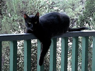
    Lovey on the railing

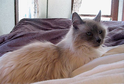
     I just spent three hours catching the three-legged cat! That's Lovey, whose shoulder was injured by being carried off by a bluejay when he was a feral kitten. The lady who heard the kitten screaming ran out threw rocks and the blue jay dropped the kitten. I got him after he was trapped. He was a pettable-only-while-eating cat for a while, but with me, indoors, he is totally friendly, pick-upable, comes when called to eat, rolls on the floor to have his stomach rubbed, hops up on my lap and purrs. When he is upset, he reverts to wild. And, apparently being loose in the wild outdoors is enough to turn him wild again.

    He fell of the roof! Well, I had just put him out on the porch, and he and Buddy got in a fight and rolled right off. I heard the commotion and looked out and saw the other cat looking over the edge. When I went out side they both ran away from me - well, Lovey hopped. That's how he gets around. Buddy showed up at the door later, and came in for dinner with a little coaxing. (He was feral too, but learned early to come through a door when called.) Lovey found the porch mid-evening, but when I tried to call him in, he left, and spent the night outside. It was the first really rainy night and morning of the year, too. And he didn't show before I went to school this morning, or when I came home mid-afternoon. There are coyotes living just down the hill, so I was worried.

    I called again about 5:30, and I guess he was thinking it was dinner time, because he showed up. And after calling awhile, and approaching very cautiously, he came towards me - closer, closer - I moved my hand and he ran. After that I was just trying to herd him to keep him from vanishing again down the hill. There was no getting close to him. Finally, at almost dark I gave up. Left the basement door propped open, and went in to feed the other cats.

    He heard me doing that, and cried from outside. "Aren't you going to feed me too?" I took a dish of noisy dried food out, and he hopped right over to eat near the porch, but wouldn't let me closer than 4 or 5 feet. So one time he spooked, I moved the dish up onto the porch, and after a while he came up there to eat. He still wouldn't let me near him. It was very dark by then.

    I felt my way down the stairs and collected a lot of large empty plant pots and barricaded the porch stairs. That worked, sort of 'cause he can only hop. Then I turned on the porch light, and took a can of cat food out on the porch, and popped the top. He came right over to it to eat, but still no touching. So I took my book out, and sat there. He would eat next to my hand, but not be touched.

    So I put the can of cat food just inside the open door, and when I sat down again, I was a little too close, and he got scared. Luckily he didn't jump off the porch. He went over to investigate the food, went in the door, started to explore - and I leaped up and shut the door on him. The hall doors were all closed so he couldn't just vanish in the house. He was scared and tried to run, so that was a good idea. So I went and got Cheesecake (the other cat), and opened the doors to where I wanted him to go. But after he and Cheesecake said hello, I guess he decided he was indoors now, and he let me walk right over and pet him and pick him up.

    So I took him into the room where he is used to eating, and put him down, and the food - and he rolled over on his back to have me rub his stomach… Tame inside, wild outside.

    The picture is a painting-style image of Lovey on the porch railing in a characteristic pose.

    Labels: , , ,

    Wednesday, October 04, 2006

    Peacock Album


    Over at Dressaday I said I would write more about wearing wide sleeves, but it's not going to be tonight. Since I failed to find a photo I can use in my files, I'll need to wait for daylight and photograph a dress or few.

    Meanwhile, here's a bonus image, just because I came across this one while I was looking for a version of the costume pic. Did this in Photoshop class last summer. The images are made on a scanner. Wouldn't it be lovely to be able to get fabric like this? I can print on 8.5x11 pieces of fabric, of course. I'm thinking of taking two of these (with the second one reversed) and putting them on the bodice or yoke of a dress. Full-length, maybe dark peacock blue?

    Or I know - I think I still have some very dark green panné velvet, with a diamondish textured pattern. If I scan that, I could use it as a background for the peacock feathers, print that, and use it on a dress made of the green fabric. That would be fun.

    I added the images from the last 2 posts to some t-shirts and things at Cafepress. I like the flowery Mead tote, and there are some tees as well. And the three dresses without the background went on some tees, including these new colored infant tees. This design, though it looks good on blue as well as white, would probably have to be for non color-coded kids. Not too many people would put pictures of dresses on their little boys. But as someone who hated pink, even as a kid, I wonder if some would like the blue tee, as well as pink & white, for their little girls.


    I'm experimenting with overdying the printed Cafepress tees without ruining the design. So far it's working very well, and I'm liking the dusty muted colors I get because of the technique I'm using. If only the warm dyeing weather had lasted a few weeks longer. Most years I'd have another two to four weeks, and in the last few years this has been prime dyeing and dye-painting season. Every afternoon after work or school for a month. The leaves for leaf-dyes haven't even started to fall.

    Labels: , , ,

    Tuesday, October 03, 2006

    A Flowery Mead


    The flowery mead(ow) was the medieval ideal for sitting out in the garden instead of grass. They made garden seats with flowering low herbs growing in them, like thyme. This picture, which you can tell was created in Photoshop, since it is symmetrical, also follows a medieval pattern design style which might have been used on an embroidered or woven tapestry. So it seems to me to be an illustration of an idealized flowery mead.

    You can also see that it's what I used as the background for the assignment in the previous post. In fact, I had a lot of fun creating a symmetrical picture which I knew would be covered up. (Although I think it will make a fun journal cover picture, and it will probably appear as one soon in my Cafepress store.) These wildflowers were photographed in Bridgeport CA in spring 2006.

    What brings this to mind is that with the cooling weather, suddenly I realized that it is bulb-planting season. And that reminds me of the most successful bit of gardening I ever did — a flowering lawn. My attempt to create the look of this picture. It has old-fashioned violets, which have a fragrance strong as wine in February — they can be smelled from the roof 3 stories up! And lots of little bulbs, which start blooming in mid-January and finish in late May.

    Soon I'll post some pictures of the real flowering lawn, and list my favorite little bulbs. But for anyone who wants to do it now — choose small spring-flowering bulbs which can tolerate summer water and grow in your zone. Plant them in early fall, while it's still nice to sit out on the lawn, if possible. And as for distributing them in a natural-looking way, don't bother doing anything fancy, like throwing them. Just dig out a weed and stick in a bulb.

    Those with perfect weed-free lawns need not apply. Well, they wouldn't want to — they'd be putting poisons on the lawn to kill the flowering invaders.

    (If you can't see this picture, let me know — I used a PNG for this image. I'll post a link to a JPG.)

    Labels: , , , ,

    Monday, October 02, 2006

    Dresses Like Spring


    This is the first rainy day of the season, though the nights have been cool and fallish since mid-Sept. This cold spell is at least 2 weeks early, maybe a month. We can usually count on warm weather through mid-Oct, and I don't expect the first frost until Thanksgiving, when I'm standing under the persimmon tree waiting for the 3rd frost to ripen the persimmons.

    But, this is the assignment I just did for class, "Dresses like Spring in a Meadow" a fictitious advertising postcard for a totally imaginary dress designer.

    The fun thing about this is the way I thought of to illustrate a dress design - draw the outline, and fill it with a photo of a batik fabric. The photos were taken with the dress lengths of fabric thrown over the clothesline. This seems to be an unexpectedly good idea - throw your fabrics over the line and stand back. It's a good way to see what the fabric looks like in daylight, at a realistic distance. I, at least, tend to think of the fabrics in their close-up, inside the sewing room view. This clothesline view gives a preview of what the dress might look like.

    Labels: , ,