 This is a copy of a letter I just sent to Dharma Trading, my favorite dye supply house for all the dyeable clothing they have. It's wonderful to have clothing available that I can have in any of my favorite colors, just by dyeing it. (Of course, I've spent half-a-dozen years working out recipes for those favorites.) I like several of their dresses, skirts, and shirts, but there are some favorite styles they don't carry.
Dear Dharma folks — I have been meaning to write you with some style requests for years. Now some of the styles I wanted are everywhere this year, and if I had written you, who knows, you might have already had them. Two things I especially wanted are full-length wrap or surplice dresses, and empire-waist tie-back dresses with flared skirts. (Also a full-length princess dress like the one you have.) Set-in or cut-on kimono sleeves. Ankle-length at least after shrinkage, with a minimum hem circumference of 120 inches or so. And please include long-sleeve versions for dressy winter dresses.
And plus sizes of course. Especially the empire-waist with flared skirts. That is the most flattering style of all time on women of ample construction. I noticed that a long time ago, when I was very slender waisted, and loaned a costume to a woman much larger, who looked fantastic in it. The flared skirts make or break the design. Do you remember granny dresses from the late 60s? They were empire-waisted but straight-cut, and had that classic sack-of-potatoes-tied-with-a-string look.
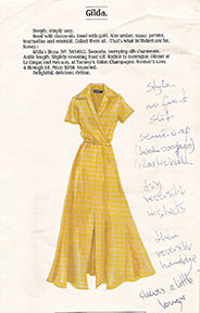
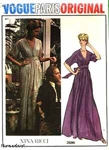
The Vogue pattern picture (top of page) is of a vintage pattern, not current, unfortunately. It seems that the waist is at the waist in the photo, but in the drawing, the altered proportions make it more like an empire waist. Notice how the drawing makes the skirt even more flared (besides the taller-&-thinner-than-human thing). They always seem to make the skirts more flared in the pictures, to make the dress look better. I say, why not cut the dress for real like that in the first place?
Do you collect old Peterman catalogs? I have a stack of them in my style notebook, with pages marked. Those classic styles keep reappearing. Here's a scan of one, a surplice waist long dress. I'd rather not have the front slit, but it'd be gorgeous on someone young. The advantage of a real wrap would be that it opens flat and could be dye painted or leaf-dyed, not just dyed.
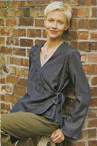
The second picture is of a wrap-top I actually bought. It is my favorite thing for a dressy winter outfit in other people's warm houses. I'd like a dozen more in all my favorite dye colors.


I'm in the process of making myself some new patterns, starting with commercial ones and combining & changing them, to make lined-reversible wrap and empire dresses. I plan to make them with hand-dyed and commercial batiks, to start with. If you made them, I could just buy them & dye them. Please?
Do I have a stack of white clothing already waiting? … Don't ask how big. I wanted to say, however, that your new Berkeley shirt is great. Just what I was looking for to wear to work. I'll probably be ready for another half-dozen soon. I think I might pleat the shoulder though, after dyeing.
I hope you'll email me back saying that you already have those styles in development, and didn't need this request. But now that I've started, I'll probably continue to bug you with requests. Are there any dye-able karate jackets out there?
Your very faithful and appreciative customer,
Mina Wagner
Labels: clothing design, dresses, letters

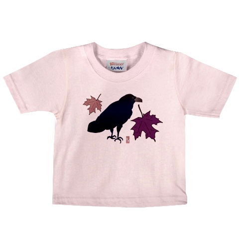
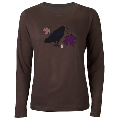
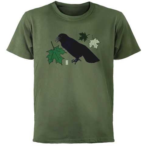
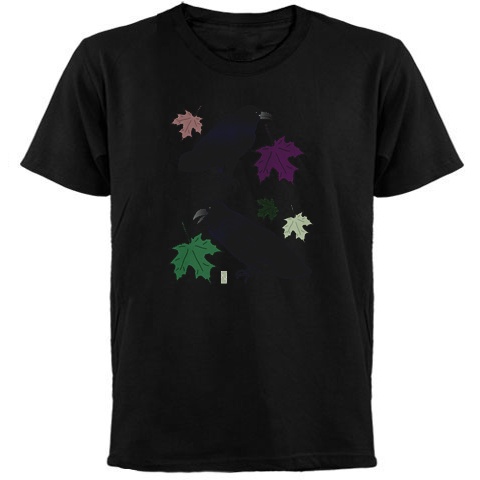
 I'm just disappointed because I had been experimenting with overdyeing my Cafepress direct print tees, and it was being fun and successful, and I liked value tees for it. I'm not sure yet if the technique will work for heat transfer.