Fabric Design Inspirations 1

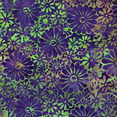
This is a batik fabric which may still be currently available, by Princess Mirah. The colors are interesting and unusual, though, typically, there are more similar combinations available right now. I'd certainly want to find any necessary coordinating fabrics now. I've just been trying to find "go with" fabrics for my stash, to make some lined-reversible dresses and skirts and wrap tops, and it's almost impossible to find any thing to work with fabrics from years ago. It's not just that the fashionable colors are different, the types of colors, the total palettes, are incompatible. Blued colors from one year, with a red cast from another. And worst, some years the colors are really grayed, some really bright, and they swear at each other. That is, they bring out the worst in each other.
But that's beside the point of what I wanted to say about this fabric, which is to point out the clever design. The use of both positive and negative as design elements especially. I mean the way some of the flower shapes are in the pattern color, and some in the background (whichever that is). This is an idea I want to remember.
Labels: fabric, fabric design
2 Comments:
What passes as 'fashionable' colours rarely coincide with the colours that look good on me (I have red hair/green eyes/pale skin), so I tend to buy up big when they do (I sew/knit/spin/weave, and dye a bit). I'm enjoying the current popularity of royal blue and IK blue, as they come around so rarely.
Your problem of colours not working together from different years is less of a problem for me, as I avoid colours with a red cast, and usually wear black/navy/olive/grey skirts with contrasting tops.
However, I've found it terribly hard to find the right colour sewing thread for fabric that's 'matured' in the stash; I really should get into the habit of buying thread when I buy the fabric, instead of assuming I can save money by using up older thread.
What I have been doing about thread colors, the last few years, is get large spools of greyed colors: grey-blue, grey-blue-green, etc.
I find that a greyer color which is not a perfect match shows up less against the background than a brighter or off-hue color does.
Since I tend to use slightly-muted to more-greyed colors, as well as batiks with lots of colors in them, this works well for me, and I usually have a color I can use.
Post a Comment
<< Home