What's in a Colorway?
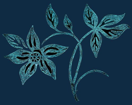 This is another tjap (batik stamp), quite a large one, which will make a lovely large-scale fabric, and also a great single image on the front of a tee or dress, maybe with a border around the hem of a long skirt. And here are two batik-possible color combinations which give quite a different feeling. I am making some virtual fabrics for some imaginary dresses for another project in my Publication Design class. So, especially since I am deliberately designing this project outside my original comfort range of colors, I am thinking about the emotional effects as well as the visual differences of various color combinations (The color theory teacher, several years ago, said that our range of colors that we used would expand. She was certainly right.)
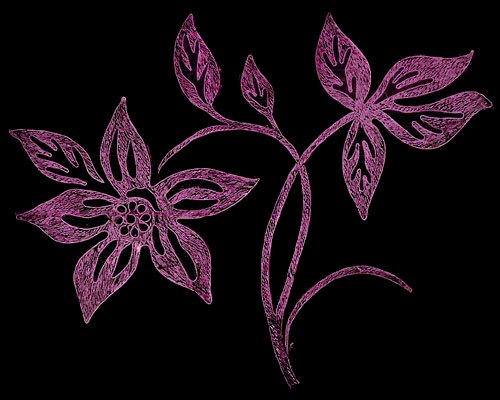 I did succeed in getting the Four Horses tjap from the last post! So the first fabric I did for this project was an alternate, non-batikish color for them. And very soon the Four Horses by themselves will be on a black t-shirt at the Cafepress site.
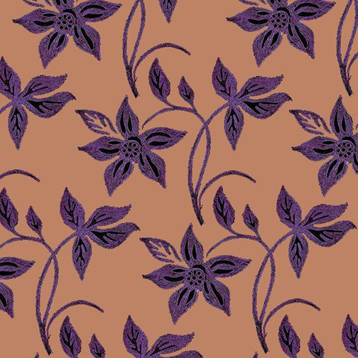
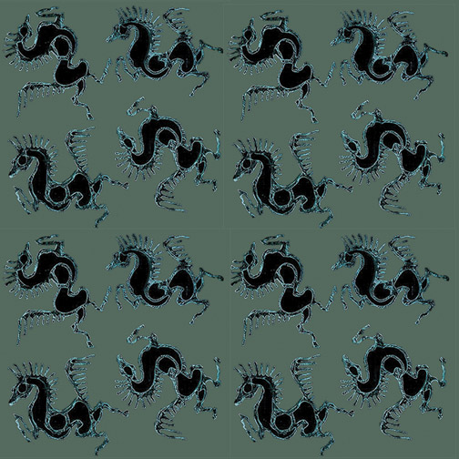 I tried a bunch of different colors both for the flowers and the background of the flower fabric. (Just using fill layers in Photoshop, and turning them on & off to save the different colors as TIFs for the print project.) Here's a couple of them, to show some of the differences. By changing which elements are light and dark, it is possible to go much farther with how different the colorways can be. The last few are more the kinds of colors I will be using for this project, though only one in each pattern, probably.
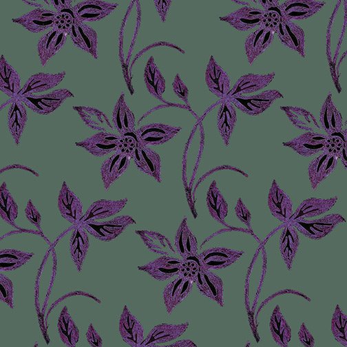 I wonder what other peoples' reaction to these color combinations might be, and how different they are from each other. We all know some people who love orange, and others who love blue and may hate orange. I'll have to look up that Goethe quote about colors—he thought he would be famous for his color theory. In my opinion, as a color theorist, he was a poet. And his emotional reactions to colors are so wildly different from most people's that it's obvious how subjective they are. People who sound more reasonable can obscure their basically subjective reaction to color.
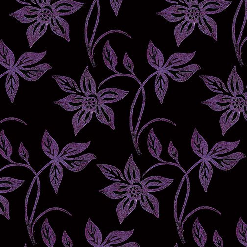 And sometimes people who claim that color reactions are universal forget the cultural differences in use of colors. In Japan, wedding kimonos may be red, if I remember correctly, and white is for mourning. I wonder if there are any hard-wired reactions. We see most strongly in the yellow-green range, yet animal warning colors tend to be yellow & black, orange & black, or maybe even red & black. That's maybe for showing up against green leaves, plus maximum contrast. If there are any common reactions, it might be to those combinations, plus sky blue and leaf green and sun yellow. But Goethe proves that not everyone will have similar reactions even to those colors. (Just the opposite of what he thought he was supporting with his pronouncements.)
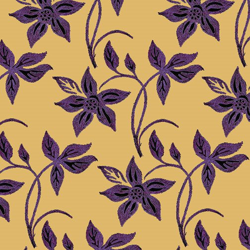

Labels: color, fabric design
posted by MinaW @ 11:37 PM
0 comments
![]()
0 Comments:
Post a Comment
<< Home