Tuesday, July 23, 2013

Full moon puzzle

full moon mandala photo, @15 sec. July 22, 2013 1am
The full moon was clear and bright in a black sky. The exposure was 15 seconds, f6.3, with a tripod.

Apparently that was enough time for the close bright moon to light up the surrounding sky.

I don't know why the photo has a star shape, with hexagonal patches of light, and a greenish sky color, but I like it.

Labels: , , , , ,

Saturday, April 06, 2013

A lovely bit of spring garden

I took this photo a couple of years ago in Nevada City. Must have been about this time of year, since the creeping phlox are sheets of color around town now, and some smaller tulips are blooming.

I wonder how I'd extend the season? Something vigorous, to compete with the creeping phlox, although it helps that it wants to grow over the edge, towards the main light. Re-blooming daylilies for summer, I think. Peach and wine colors... Or since this is in town, maybe no deer, (the tulips wouldn't be there if there were deer.)  Madonna lilies for late spring/early summer. A smaller-scale ornamental grass? Catmint?

What a charming visual gift to the passerby!

Labels: , , , , ,

Thursday, October 29, 2009

Colorful Bob


The original of this picture of Bob was taken when he was about a year old, visibly still a young cat, looking very alert and wild in the tall grass at the edge of the yard. Bob was maybe born in 2002. He wasn't very old at all.


I scanned the picture in, and Photoshopped it, the summer of 2006, when I was taking Photoshop my 2nd summer in school. The original is a tall young orange cat in green grass. The colors were changed with exaggerated Curves, and I textured it with a filter. One of my favorite Cafepress t-shirts has this image on it, and it makes an interesting mirrored fabric at Spoonflower. Mom liked the t-shirt.

Now those images are just going to make me sad. Bob died today. I wish I had taken just 10 minutes, in the rush to get out of the house to the airport, and held him on my lap and said goodbye.

Goodbye Bob. I love you, even if I couldn't be there with you.


Many thanks, beyond thanks, to Larry who is making it possible for me to be here in many ways, including taking care of poor Bob.

Labels: , , , ,

Wednesday, April 15, 2009

Spoonflower hooray!

At Spoonflower (www.spoonflower.com), you can upload a design, and get digitally-printed yardage with your design printed on it! I only have about 114 designs sent to them so far, and have gotten some successful samples in light and medium colors. *

This is a design that started as a small dye-painted square of test fabric. Then I scanned it, Photoshopped it to get many colors, and made an array so it could print as yardage. Soon I'll order a sample to see how the colors come out. Then if that works well, I'll get a couple of yards to make perhaps a knee-length vest, lined in a teal fleece which I got for that, and then found it didn't go with the batiks I intended to use. And it will be my unique fabric.

Your designs remain private unless you choose to make them public, but no one except your self can buy them now. Someday. Unless one of your designs is chosen to be in the weekly contest, and it wins - in which case people can buy it for a week. And you would win some fabric. Right now they're printing on a quilting-weight cotton. Other fabrics later. (Update: several more fabrics now available, in different widths.)

This is a lot of fun. Click on the fabric to see some of my other designs.


*(Dark or black backgrounds with low-contrast images don't work well.)


11-09 UPDATE Spoonflower now makes it possible for us to put our fabrics up for sale, but only the ones we have ordered swatches of. So I have a couple available for sale now, and more coming. This one soon. 11-29-09 This one is now available for sale: 
http://www.spoonflower.com/fabric/111479

Labels: , , , ,

Sunday, July 06, 2008

Batik Mandala


12/18/07 This is a new design for a Cafepress t-shirt. It's based on a scan of a copper batik stamp (tjap). The color scheme is right out of the textbooks: purple, red-violet & blue-violet, and the complementary gold & yellow. I have to admit it works. The version I'll use at Cafepress will have the background removed, so the color of the t-shirt will show through. I think it will look particularly good on black, navy, and the brown longsleeved women's tee.

If I can do some fabric for a skirt with the stamp, just a simple natural fabric color design on purple-dyed fabric, that ought to be fun to wear with a tee. I got this stamp to give away, so if I do anything with it, it has to be soon.

Unfortunately, since it's a large one, it does not fit into the little electric frying pan I have to heat wax in. I have been trying to find an old electric fry pan at the thrift stores, but haven't turned up one yet.

6-20-08 I just got a section made at Cafepress for this design: WRW Color by Design - Fabrics by Design section

7-6-08 I hope to do some experiments these next 2 weeks with soy wax for batik: lower temperature, easier cleanup and removal from the fabric, and can use cooking pans too, not just wax-only containers.

Labels: , , , , , ,

Wednesday, June 25, 2008

Where there's smoke . . .


There's fire? Well, somewhere, but not here. The closest is near the little town of Washington. But there're fires all over N California, more than 840 of them started by one lightning storm last weekend. The previous record was 73.

On Saturday, some friends and I had gone to Downieville for their Gold Rush Day; costumes, shootouts (picture 2 terrified little kids in a twin stroller, 10 ft away from a victim), stagecoach rides, food and crafts. And an appearance at the little local theater (in which the original Mark Twain had spoken) by "Mark Twain", the celebrated lecturer. We went especially to hear a friend who was providing the live music for Mark Twain's performance.

During Mr Twain's talk, the lights went out. When they came back on a minute later, and Mr.Twain was reclining in a chair, instead of standing behind his lectern, we thought it was part of the show. Then the lights went out again, and stayed out, while we heard repeated thunder outside. So there was Mark Twain, lecturing in the dark, in a little old theater, in a thunderstorm.

Very Old West. But unfortunately, no rain. So there are lightning fires all over, many still burning. And smoke everywhere, for days now.

Looking at the hills and trees receeding into the smoky distance, it made me wonder just how smoky the Italian Renaissance was. I think I remember that that was when painters discovered "atmospheric color", in which the more distant landscape elements are, the lighter and bluer they are. And I think the answer might be, not this smoky, but more than nowadays, judging by the backgrounds to some of the pictures.

I had opened some windows last night, to cool the house off, and because there was less smoke. Then about 3:00 AM it got more smoky again, and I went around closing windows. (Well, not the ones that require climbing a ladder to take the screens out, not in the dark without my glasses on.) And the moon was as copper-colored as it was last summer during its eclipse. And the sun rising this morning was flame-colored.

Another thunderstorm due this Saturday.

Update: the final total of fires for that storm was somewhere around 1200!

Labels: , , , , , , , ,

Friday, December 21, 2007

Papercut color


I did this design several years ago when I was taking color theory, as a papercut. It was my favorite of several I did at the time. Red-violet & blue-green, two colors that are both capable of looking either warm or cool, depending on context. The idea is that it looks like a light is shining through the page.

The inspirations for this series of designs included Harriet Hargrave's books on Baltimore Album papercut-design quilts, and the symmetry of William Morris' fabric designs.

I always thought it would be fun on a t-shirt. Now, with Cafepress, I just have to send them the design to have it on a tee. Also, of course, a pillow, and a tile box and a round ornament or magnet. This version has been Photoshopped for richer color and some texture.

With luck I'll have a new section for it up at Cafepress this weekend. Leave me a comment if there's any particular item you'd like to see it on that I don't have.

July 6 2008

I got the whole section done up at Cafepress, including the new color t-shirts, and my new color variants on the design a few weeks ago. WRW Color by Design

And now, at Spoonflower, I can have one of my alternate color versions tiled as fabric, unique custom fabric, digitally printed!

Labels: , , , , , , ,

Sunday, June 10, 2007

Kaleidoscope Night Sky


This is my coloring of a classic quilt pattern called Kaleidoscope. I designed something similar some years ago, but never made it. I didn't mean to stay up so late last night drawing it in Illustrator, but it took a long time to figure out how to recreate this effect; the coloring is not at all the classic one. I wanted to get an illusion of depth, and of light shining through the surface, and I think this succeeds. Half-close your eyes to see the light and dark pattern better.

When I first designed this (with colored pencils and markers on graph paper), part of what stopped me from making it was the potential difficulty of finding the fabrics with the color gradients needed to get the effects of depth and light. Traditional fabric printing doesn't do gradients very well. I wasn't dyeing yet. Now I could dye or dye-paint a gradient that could do those patches. And since I used my favorite colors, these are ones I have worked out how to dye.

I could have found a black with white stars fabric, probably. In this version, those tiny stars are 5 and 6 points, and they have colored edges. I'd never find a fabric like that, though now I could dye-paint a black and white batik with faint star colors.

There are at least 3 sizes of circles in this design that can be brought out by the coloring; this version shows the mid-size one. Although I have used colors halfway between the blue and blue-green, and the blue and purple, in those overlapping circles, it just looks right, not as if the colors are a transparent overlap, which I thought it might. (By the way, there's one gradient direction error in the picture - do you see it? I never have to worry about the hubris of trying to rival the gods with perfection, since I always make errors. And no need to put in a deliberate error either, like the Amish.)

Now in the comments at Dressaday on the June 6 Black and Pink stripes post, Jasmin told us about digital textile printing for fabrics. This is a similar process to printing on treated fabrics with your inkjet, and fixing the prints (supplies at dharmatrading.com) which I've done. But unless you have a very large printer, that's only for 8.5x11 inches pieces. These new technologies are becoming available for custom printing even for small yardages, if you have digital images in the right formats. And they do millions of colors beautifully, so gradients will work.

So I could have printed enough for a bedspread or wall-hanging, or a designer dress! Or sell the design to a digital printer who wants to make commercial yardage. At a minimum I'm going to upload a high-resolution version to my Cafepress store, WRW Color by Design and put it on a throw pillow with black borders, since I'd love to have one of them. And maybe a black tee-shirt…

Labels: , , , , , ,

Thursday, January 04, 2007

I just read this color book

I just finished reading the best book about color mixing for artists, Blue & Yellow Don't Make Green by Michael Wilcox, and found his site, www.schoolofcolor.com and wrote him a letter.

Jan 1, 2007
Dear Michael Wilcox,

When I was in high school, I remember asking the physics teacher what made a material colored, what was the interaction between light and matter that produced color. His answer was "That's a good question" which my father decoded for me as saying that he didn't know the answer.

Since Dad was a physical chemist, he provided part of the answer: the energy of a photon of a particular wavelength of visible light must be matched by the energy absorbed by an electron as it jumps to an available space in a higher orbital shell. That is what physically happens when light is absorbed by material. The chemistry of this is different for each substance, and thus the wavelegths of light that can be absorbed. If the lesser energy released as it falls back into its original orbital shell is in the visible range, that is fluorescence.

I have always been interested in color; I wish I had pursued that interest further long ago.

I just finished reading Blue & Yellow Don't Make Green, which I had heard of when I took a color theory course several years ago. That course expanded my universe. You have just given it another dimension. I was excited to see the books shown in the back on Colour in Gardening & Quilting, and disappointed to not find them available yet.

As a fabric dyer, color mixing is one of my major interests. I started dyeing because I wanted to make a complex color wheel, useful for color choices in quilts & wearable art, and the colors were not available in fabrics. The whole process of dyeing and figuring out color mixes became totally absorbing, and quilting got forgotten. Now I am trying to set up a color mixing system of dye primaries for Procion MX fiber reactive dyes, to put on the web.

It is disappointing that almost all the books about color for quilters and fiber artists use the same old grade-school color wheel. I was working in a bookstore when one of them, Christine Barnes, was writing her book, and I pointed out to her the books on color theory by Jim Ames & Jose Parramon, which at least use a different three colors from red yellow & blue. She said she'd stick with the color mixing she was taught in school, rather than present any alternate ideas. So does everyone else, apparently, but perhaps partly because they don't know any alternative exists.

The best of the quilters writing on color that I've found, Joen Wolfrom, uses the Ives color wheel, with yellow, turquoise (cyan), and fuschia (or magenta) as the dye primaries. I still wasn't happy with the bland colors I could mix with those primaries, which are similar to printers primaries.

So I went to other color-mixing primaries, and also mixed from mixed colors, to get the rich jewel tones I like. Fiber reactive dye chemistry is different than paints, and the pigments are not the same, but your system of thought makes sense of the rich colors I could mix without being able to explain. (red + green = purple?) (violet-red + teal-green)

I can mix much richer dye colors than the gamut a printer can reproduce with a CMYK system. Now I have an idea why. Thank you.

Mina Wagner

For future articles that I would like to see:

Color as used in batik, which can involve many layers of dye application, and in which color planning is particularly important, would be of great interest to me. I have spent years developing a dye palette, but don't have all the colors of the rainbow figured out. Also, many layers of dyes complicates understanding the results. It's why I took color theory originally.

Also, enamel glazes on silver or gold involve rich depths and layers of color. There I have some design ideas, but without the years of recipes. A guide to the behavior of specific colors in mixes would be welcome.

PS This isn't Michael Wilcox' color wheel, it's an RGB-CMY one I've been playing with.

Labels: ,

Sunday, December 10, 2006

New logo & Color 101 part 1: RGB & CMY


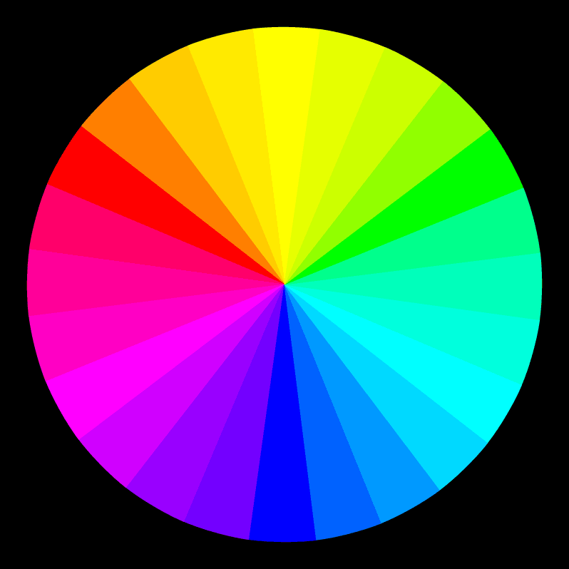
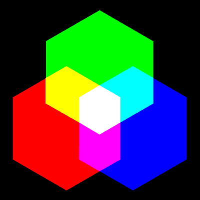
You are in a dark room. A beam of light reaches out to the white wall. It's green! Then another. It's blue! And where they overlap, twice as much light, twice as bright, and the color is called cyan. Sort of sky color. It's usually called turquoise in fabric dyes. Then another beam of light . Red! And it moves until it overlaps too. Where it overlaps the blue light, brighter than either, is a sort of purple-pink. You can see that it's a mix of blue and red. That color is called magenta in lights and printing inks, and usually fuschia in fabric dyes. Where the red overlaps the green light beam, twice as bright, is yellow. Sun color.

And in the center, where all the lights overlap, is white. The sum of all the 3 beams, Red, Green & Blue. Or the sum of any 2 opposites. Red light plus cyan light. Green light plus magenta light. Blue light plus yellow light. The sum of two complimentary lights is white light. The primary colors of light are Red, Green and Blue. The secondary colors (made by mixing 2 primaries) of light are Cyan, Magenta and Yellow. Those are also the primary colors of printing inks in the CMYK system, along with Black (K). The primaries of fabric dyes, equivalent to cyan, magenta, & yellow, are Turquoise, Fuschia, and Yellow. And in fabric dye, unlike inks, black is a mix of several colors.***

"But, but, but… That doesn't have anything to do with real life, does it? That's just an arbitrary system; It's only for computer screens, isn't it?" and "But, but, but… That isn't the color wheel we were taught in school! That can't be right. Blue wasn't opposite to yellow, was it? I'm sure red is opposite to green, not that funny magenta color. And where did that other blue come from? I'm sure red was opposite to green!" and, quietly, plaintively, "Why is the green so much brighter than the red and blue?" and maybe "Where's orange?" or "Why isn't there any real purple?"

This is the first of many posts about color. And I know I don't know everything, or even most things, about the subject. But to begin to address those questions — my first introduction to RGB color was in a classroom, with the scene described above. The Photomicrography teacher was shining colored lights at the wall. And when you see the light beams overlapping, and making those brighter colors, and then white, you have to start by admitting that this is real. This is the way the colors of light work.*

For years I thought of this as only an alternate color system, along with that system that was taught in school, with red, yellow & blue as the primaries, green, orange & purple as the secondaries. The paint-mixing color wheel. The "artists" color wheel. Because everyone was so dogmatic about how that was the "real" color wheel.

I made a color wheel based on the primaries of light, and used it for cross-stitch & quilt designs, and gardening. Because, if you compare them, you will see that this wheel expands the blue-to-green portion, and decreases the orange part. And first, I preferred it that way. And second, for garden designs, it seemed appropriate to expand the sky & leaves part of the wheel. But I was still thinking of this as just an alternate choice.

Then, I was working in a bookstore. And there are at least 2 books** out on color, from art house publishers, for artists, in which the writer is jumping up and down and waving his hands and shouting "Hey look eveybody! Look you guys! Look what I've found out! If you mix your paints starting with yellow, cyan & magenta instead of yellow, blue & red, as primary colors, you'll get much brighter colors!" As far as art education goes, or new books written on color, for quilters perhaps, this has mostly been ignored. But if you happen to take a college art course, and there happens to be a color wheel on the classroom wall, you may notice that although the primary colors are still labelled Yellow, Red & Blue — Red is definitely not fire engine red any more, but has migrated towards magenta, and blue is definitely not royal any more, but much more like cyan or turquoise. Unfortunately, they haven't redone the rest of the colors. The same orange, green and purple are still the secondaries. It makes the wheel look really unbalanced. But they are pretending, by renaming things, that they were right all along.

And on the question of what is real… Our eyes have rods and cones in the retina for detecting light. Rods work better than cones in low-light conditions, and detect only light to dark, or luminosity, not color. Cones are for detecting color. There are 3 kinds, the ones that detect Red, Blue or Green. Those primary colors of lights, Red, Green & Blue, are chosen because those are the primary colors of how our eyes detect color.****

And if the Red & Green cones react with equal intensity, we see yellow. (You were wondering how red & green added up to be yellow, weren't you?) And our eyes see most strongly in the yellow-green range (new-leaf color). So we see green light of the same intensity as brighter than red or blue.

And finally, all color wheels are figments of our imaginations. Light comes in wavelengths of the visible spectrum. Isaac Newton, who first described the spectrum of visible light, after splitting white light with a prism, named the colors he saw Red, Orange, Yellow, Green, Blue, Indigo & Violet. (Indigo, a dye, is the color of classic blue jeans. So the color he called blue is undoubtedly the bright cyan band which is very visible at the edge of the greens.) He put the colors back together into white light again by sending them through another prism. And he put the colors into a circle, adding purple, and made the first color wheel. He had to add purple (or red-violet) because it doesn't exist in the visible spectrum of light. Our eyes make the "non-spectral purples" by adding together other colors of light from the two ends of the visible spectrum of light.

If you're really interested in this, do see if your local college or community college has a Color Theory course. I guarantee it will expand your universe. And I hope you get a teacher as excellent as Pat Chapin, who was teaching it at our local community college, when I took color theory several years ago. And for books, be sure to look in the physics section as well as the art section of the library.

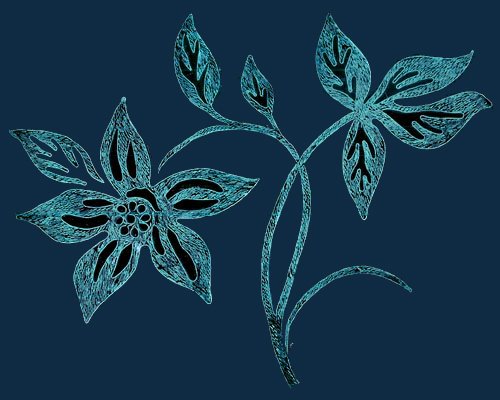
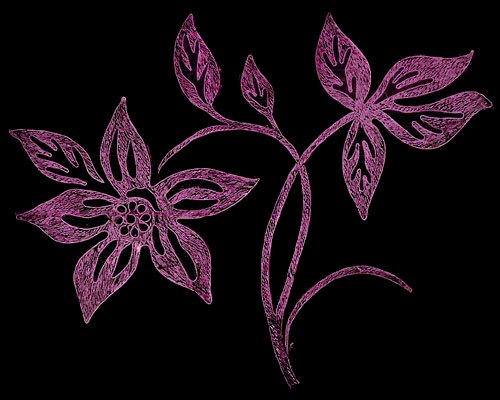
Oh, new logo? Well I'm designing myself a website for the web design class, and I needed a logo. And doing that is what prompted me to start on this color explanation, finally.


*For photographers — you don't get the same effect by overlapping filters. Filters are taking away all but the selected color. When you overlap filters, you get only the light, if any, that isn't eliminated by either filter.

**Watson-Guptill published at least one of them, maybe both. I think one might have been about water color, one about oils. I think José Parramon might have written one of them. One of them went very thoroughly into the subject of afterimage colors, exploring just which exact shades were the visual opposites of a lot of colors. (For one set of eyes.)

***Dyes and inks are dependant on chemistry; either there is a single pigment which absorbs all wavelengths, making black, like charcoal, or there isn't. And if there isn't, like in fiber-reactive dyes, then blacks and grays are made by mixing several colors. So fiber reactive blacks will have a color cast, and color halos, as dye spreads in tie-dyeing. And if there are undissolved pigment spots, they might be red, in a grey with an overall greenish cast.

****Yes, psychological color has four primaries; red, green, blue & yellow. I'll study up on that, and see if I can explain it later. And no, not everybody's cones are the same. We don't all see the same red. More later.

Labels: ,

Wednesday, November 29, 2006

Another Cafepress print comparison


After Cafepress' recent announcement that Value tees will now only be heat transfer, I was reminded to publish another comparison of the results of the printing methods. This design, which I have shown before, I had printed both ways. The heat transfer, on the right, is brighter and clearer, and in this case, pretty true to the origninal colors, which can be seen at http://www.cafepress.com/wrwcolors/1263976.


I'm just disappointed because I had been experimenting with overdyeing my Cafepress direct print tees, and it was being fun and successful, and I liked value tees for it. I'm not sure yet if the technique will work for heat transfer.

Here is the image on a mug. I just put it on the scanner, then played with the colors a little in Photoshop to get them to look as close to the mug in my hand as I could. As with other images, it comes out bluer and darker on the mug. I have a lighter version I did for the black tee, so I'm going to switch images, I think.

Labels: ,

Thursday, October 26, 2006

Color with a Difference

This is an example of the glories of Photoshop. Different blending modes can create these different looks of the same fabric design. (A different method of producing new colorways than I was using when I showed these designs before.) In the case of the second fabric, making more of the leaves show the veins would create a more successful design, I think, with more texture variation.

Labels: ,

Monday, October 23, 2006

Color Compositions

Below is my comment at Dressaday 10-22-06 (And Shoes), where Erin asked if we had the recommended two or three color wardrobe. Lots of wonderful colorful answers.

This picture is an example of a couple of the color principles I've listed below:
#1—two similar colors fighting with each other rather than working together. The shades of sage and aqua on the dress do, I think, go together well, but it was hard to find the exact shades that would. They are also an example of a potential fade-into-the-wallpaper muted combination.
#5—The red-violet background to the sage-&-aqua dress is an example of the muted complimentary combination, in which the colors brighten each other to our eyes, but the total is still not too bright for those who prefer mixed, muted colors
#1—The background yellow-green and the sage are a definite example of similar colors which really don't work together. In Chevreul's words they "injure" each other.

MinaW said

"I used to have only a few colors — bluegreens especially — in my closet. I also used to be so pale that black, grey, or the brights like orange made me look like a dead fish-belly, so my choices were somewhat limited. (The only sort-of-brights I could wear were very mixed: peach, aqua, violet.)

Then I started dyeing fabric and clothes, and my choices expanded to new favorites I hadn't even known were possible. And I took color theory, and learned how to combine any colors, even previous unfavorites, in ways I liked.

A couple of things I've learned:
1—If your closet only has shades of one or a few colors they don't all go together! Too close shades of the same color can often fight, not enhance each other. This is true of black or grey or white too.
2—Neutrals like gray have color in them too, it's just hard to see what it is. But put two greys next to each other; one might go green, the other red, and you can see what the underlying shade is. (I discovered this working in a carpet store, where a whole houseful of something that turned out to be an unexpected green-gray or pink-grey could be a disaster. (Especially when the couch or wallpaper it was chosen to go with went the other way.)
3—For those who have lots of shades of one or a few colors in your wardrobe, where it might be hard to find a cardigan or jacket that goes with them, go to a complimentary color. When I had mostly blue-greens, and started branching out, a muted purple or red-violet went with everything in the closet.
4—Don't stress about not knowing the color wheel and what's a complimentary color. The color wheels are all wrong anyway. Use your eyes; choose a contrast you like the look of.
5—If like me, you tend to prefer somewhat muted colors, and worry that you fade into the wallpaper… you may be very pleased with the muted-contrast combination. Choose your favorite muted color. Now go to an approximately opposite color, and choose a muted version you like. The two, being sort-of opposites, will make each other brighter to the eye, and yet not be so bright they scare you.
6—A trick from quilting: choose prints which contain colors you like to wear together. Then it suggests a whole bunch of combinations, and goes with lots of your clothes. Just don't make the corollary quilter's error and get too boring by being monochrome (all shades of one color) with no contrast.
7—The stategy of having neutrals in skirts, and colors in tops, like someone mentioned, can make bringing in colors easy. As a roommate & I discovered long ago, a flattering neutral can be a duller version of your hair color.
8—The idea of a key piece of jewelry or garment like a patterned skirt or decorated jacket, with a collection of colors you like, is a great way to tie an outfit, a wardrobe, or a suitcase-full of clothes together." (India & Oracle mentioned this strategy)

9—And the one I didn't say there, 'cause it seemed to be getting into too much color theory, is that all colors with similar amounts of grey in them go together, but it's much trickier to put them with colors with different amounts:
A—Pastels all go together, and white is the neutral that goes with them. Grey and black make the pastels look washed out. So do brights.
B—The rich jewel tones go together, and work with black beautifully. They shine against it. This includes gold.
C—The pure color-wheel colors go together, and they work with black or white. These are very bright combinations. For a little more harmony, use fewer of them: blue & yellow. And/or use related ones: orange & red or blue & purple. Also, using white with them, like using white flowers in a garden, can tone down some of these blinding combinations.
D—The muted, mixed colors go together, and will work well with greys. Use the opposites or near-compliments together to avoid too dull an effect.

And the one that only Chevreul, of all the color theorists, mentions. (He first proposed most of the major color harmonies, and especially figured out simultaneous contrast, in which colors next to each other cast an afterimage of their opposites on the colors next to them.) The colors that most theorist just call analogous — the colors that are next to each other on the wheel — most just say they go together. Chevreul saw that two of these which were too similar "injured" each other. Of course, he was using a color wheel with about 10 times as many colors as most, so he was truly looking at similar colors. And he gave the solution to using them together:
10—To put together very similar colors, make one darker, the other lighter, to add contrast. Or even make one a mid-greyed tone, and the other light or dark and purer.

Long ago, when I met the first other person who had my name, she turned out to be the most eccentric old lady one could ever wish to live up to. And she believed that as one got older, our colors should get brighter. Very much brighter.

Labels: , , ,

Do you define yourself by what you wear?

I have come to think of clothing as an art form mostly* unconnected to the appearance of the person serving as the dress form inside it. This is very liberating as a personal dressing philosophy. If I'm showered and comfortable in what I'm wearing I certainly don't worry about the fashionability of the hem length. (Or how bright my newly-dyed t-shirt is.) I buy colors when they're in fashion, to wear during the long droughts when there aren't any colors I like.

And, because I notice clothing, I often compliment women on what they're wearing, whatever the size or shape of the woman inside. It could be their oldest sweater which is a great color (often I find they say that the garment I've noticed is old — I figure that means it's a favorite). I try to avoid personal comments, except maybe "It's a great color on you".

Often the piece I notice will be a large shirt in a great fabric. Super. I like them myself. And when dresses were showing up more and more, and I was working outside and wearing jeans and a uniform shirt, I was very happy to see everybody's options expanding.

Is this just California? One day I noticed in the hardware store, within half an hour, a lady in an ankle length dress, one in a flared black mini with striped tights, one in jeans and tatoos and muscles and a midriff-baring top, and a guy in jeans, a muted lime tunic, & peace symbol pendant. I love the freedom of expression available.

And notice that each of those send a different message to the viewer. The thing I realized years ago, after hearing that a friend had not gotten into medical school because she wouldn't wear a skirt to the interview, is that it's all costume. We can choose what message we send, and choose it differently each day. It does not define us, unless we let it.

*mostly unconnected to the appearance of the person serving as the dress form inside it Mostly because given my choice I'll prefer something which is cut to be flattering and easy to move in and well-fitted for comfort. And a color that when I was paler made me look like a dead fish-belly (like orange or black) did not make me comfortable.

This dress was drawn from a vintage pattern or dress that Erin showed over at Dressaday, with the large pattern to look like a hand-painted design.

The colors of this design are way outside my original comfort range, and I love them together. The color theory teacher was right; it's possible to use any colors and make them look good.

(These were my comments on "You don't have to be pretty", 10-19, at Dressaday.) More later.

Labels: , , ,

Tuesday, October 17, 2006

What's in a Colorway?

This is another tjap (batik stamp), quite a large one, which will make a lovely large-scale fabric, and also a great single image on the front of a tee or dress, maybe with a border around the hem of a long skirt. And here are two batik-possible color combinations which give quite a different feeling. I am making some virtual fabrics for some imaginary dresses for another project in my Publication Design class. So, especially since I am deliberately designing this project outside my original comfort range of colors, I am thinking about the emotional effects as well as the visual differences of various color combinations (The color theory teacher, several years ago, said that our range of colors that we used would expand. She was certainly right.)
I did succeed in getting the Four Horses tjap from the last post! So the first fabric I did for this project was an alternate, non-batikish color for them. And very soon the Four Horses by themselves will be on a black t-shirt at the Cafepress site.
I tried a bunch of different colors both for the flowers and the background of the flower fabric. (Just using fill layers in Photoshop, and turning them on & off to save the different colors as TIFs for the print project.) Here's a couple of them, to show some of the differences. By changing which elements are light and dark, it is possible to go much farther with how different the colorways can be. The last few are more the kinds of colors I will be using for this project, though only one in each pattern, probably.

I wonder what other peoples' reaction to these color combinations might be, and how different they are from each other. We all know some people who love orange, and others who love blue and may hate orange. I'll have to look up that Goethe quote about colors—he thought he would be famous for his color theory. In my opinion, as a color theorist, he was a poet. And his emotional reactions to colors are so wildly different from most people's that it's obvious how subjective they are. People who sound more reasonable can obscure their basically subjective reaction to color.

And sometimes people who claim that color reactions are universal forget the cultural differences in use of colors. In Japan, wedding kimonos may be red, if I remember correctly, and white is for mourning. I wonder if there are any hard-wired reactions. We see most strongly in the yellow-green range, yet animal warning colors tend to be yellow & black, orange & black, or maybe even red & black. That's maybe for showing up against green leaves, plus maximum contrast. If there are any common reactions, it might be to those combinations, plus sky blue and leaf green and sun yellow. But Goethe proves that not everyone will have similar reactions even to those colors. (Just the opposite of what he thought he was supporting with his pronouncements.)


Labels: ,

Wednesday, October 11, 2006

A Philosophy of Salads, Sandwiches, & Cross-stitch Designs


What do these things have in common, you ask? Well, maybe only my common philosophy for them, approximately stated as "less is more". If you always put everything in a sandwich, if "it isn't a sandwich if it doesn't have 2 meats & 3 cheeses", as an unnamed relative says, then your sandwiches always taste the same, even if half the ingredients are different. If you limit a sandwich or salad to 3-4 ingredients, then each time it tastes different.

The application of this idea to cross-stitch designs is a little different, but it's the same sort of personal predjudice on my part. If a stitchery design has a sea of amorphous shapes in lavenders and purples, and it's supposed to be violets, I don't like it. I want a design of stitches which, if it's done in yellow, people will say "Oh, yellow violets!". And, preference again, I prefer this to be done, if not with the fewest stitches possible, (I can do a violet with fewer than I show here, I think), then at least with a fairly small number of stitches. Partly this is for economy of stitching time, but mostly it's for the design freedom it gives me. But I insist that the flowers be recognizable when graphed out in black & white. Maybe even identifiable to species, like one in this sampler.

My other design preferences are mostly visible here, I think. One is another example of "less is more" — analogous colors. That is, colors which are next to each other on the color wheel, sometimes with a very small amount of an opposite color (here yellow). These colors range from blueish-green to red-violet, and that is certainly my long-time favorite. But I have favorite combinations of pansies that use the red-violet to peach, with mauve and plum and green. (Always remember that green is a major part of garden color combinations, as are dirt & sky, and here tree trunks & pine needles.) And red-violet, blue-violet, and yellow-green. Or forget-me-not blue with primrose yellow and leaf green, against a white wall. Each time few colors, fewer if they're opposites, more if they have something in common, like those next to each other on the color wheel.

Another preference is for symmetries reminiscent of medieval and renaissance designs, like William Morris used. You can see that in this sampler, in a simple way. Tomorrow I'll post the other half of it.

And I think I'll go get some pansies after school tomorrow…

Labels: ,