Another Cafepress print comparison

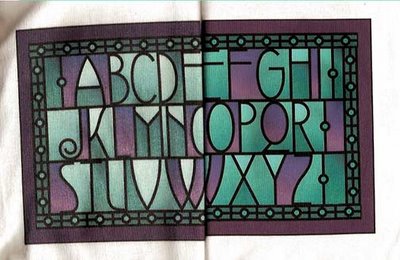
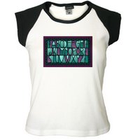
After Cafepress' recent announcement that Value tees will now only be heat transfer, I was reminded to publish another comparison of the results of the printing methods. This design, which I have shown before, I had printed both ways. The heat transfer, on the right, is brighter and clearer, and in this case, pretty true to the origninal colors, which can be seen at http://www.cafepress.com/wrwcolors/1263976. I'm just disappointed because I had been experimenting with overdyeing my Cafepress direct print tees, and it was being fun and successful, and I liked value tees for it. I'm not sure yet if the technique will work for heat transfer.
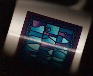
Here is the image on a mug. I just put it on the scanner, then played with the colors a little in Photoshop to get them to look as close to the mug in my hand as I could. As with other images, it comes out bluer and darker on the mug. I have a lighter version I did for the black tee, so I'm going to switch images, I think.
2 Comments:
The Value T-shirt will be done as a "HEAT TRANSFER" rather than Direct Print.
Corrected, thanks.
Post a Comment
<< Home