Friday, May 01, 2020

Between Every Two Pines

Between every two pines is a doorway to a new world.  John Muir

I found this wonderful quote by John Muir for the booklet I did for Mom's memorial service. It's something like the way I always felt, thinking about going back into the woods on my own, when I was a kid.

I took the picture in a graveyard up near North San Juan, after another funeral; I was looking for two pines.

Now I have made it a transparent picture for dark t-shirts, and like this for cards and journals. (Photoshop online made available by the college, whose students can't come to campus to the library now.)

Maybe with the quote below it instead of interrupting the sky...

Labels: , , , , , , , , , ,

Sunday, July 06, 2008

Batik Mandala


12/18/07 This is a new design for a Cafepress t-shirt. It's based on a scan of a copper batik stamp (tjap). The color scheme is right out of the textbooks: purple, red-violet & blue-violet, and the complementary gold & yellow. I have to admit it works. The version I'll use at Cafepress will have the background removed, so the color of the t-shirt will show through. I think it will look particularly good on black, navy, and the brown longsleeved women's tee.

If I can do some fabric for a skirt with the stamp, just a simple natural fabric color design on purple-dyed fabric, that ought to be fun to wear with a tee. I got this stamp to give away, so if I do anything with it, it has to be soon.

Unfortunately, since it's a large one, it does not fit into the little electric frying pan I have to heat wax in. I have been trying to find an old electric fry pan at the thrift stores, but haven't turned up one yet.

6-20-08 I just got a section made at Cafepress for this design: WRW Color by Design - Fabrics by Design section

7-6-08 I hope to do some experiments these next 2 weeks with soy wax for batik: lower temperature, easier cleanup and removal from the fabric, and can use cooking pans too, not just wax-only containers.

Labels: , , , , , ,

Friday, December 21, 2007

Papercut color


I did this design several years ago when I was taking color theory, as a papercut. It was my favorite of several I did at the time. Red-violet & blue-green, two colors that are both capable of looking either warm or cool, depending on context. The idea is that it looks like a light is shining through the page.

The inspirations for this series of designs included Harriet Hargrave's books on Baltimore Album papercut-design quilts, and the symmetry of William Morris' fabric designs.

I always thought it would be fun on a t-shirt. Now, with Cafepress, I just have to send them the design to have it on a tee. Also, of course, a pillow, and a tile box and a round ornament or magnet. This version has been Photoshopped for richer color and some texture.

With luck I'll have a new section for it up at Cafepress this weekend. Leave me a comment if there's any particular item you'd like to see it on that I don't have.

July 6 2008

I got the whole section done up at Cafepress, including the new color t-shirts, and my new color variants on the design a few weeks ago. WRW Color by Design

And now, at Spoonflower, I can have one of my alternate color versions tiled as fabric, unique custom fabric, digitally printed!

Labels: , , , , , , ,

Sunday, June 10, 2007

Kaleidoscope Night Sky


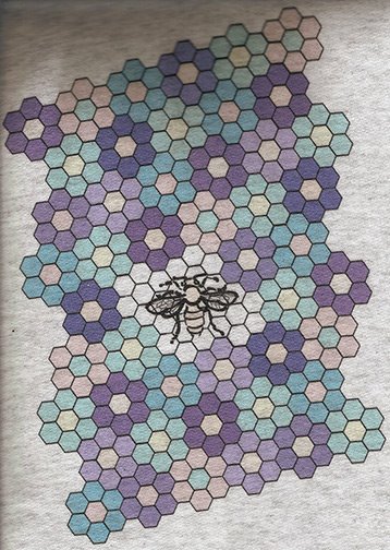
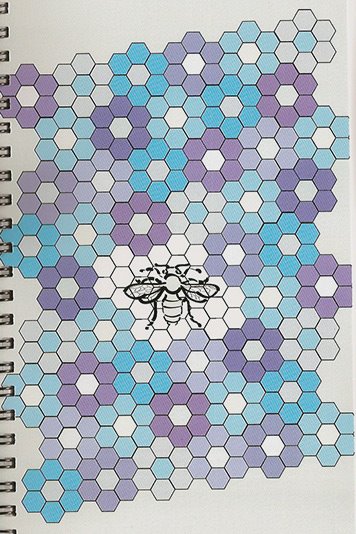
This is my coloring of a classic quilt pattern called Kaleidoscope. I designed something similar some years ago, but never made it. I didn't mean to stay up so late last night drawing it in Illustrator, but it took a long time to figure out how to recreate this effect; the coloring is not at all the classic one. I wanted to get an illusion of depth, and of light shining through the surface, and I think this succeeds. Half-close your eyes to see the light and dark pattern better.

When I first designed this (with colored pencils and markers on graph paper), part of what stopped me from making it was the potential difficulty of finding the fabrics with the color gradients needed to get the effects of depth and light. Traditional fabric printing doesn't do gradients very well. I wasn't dyeing yet. Now I could dye or dye-paint a gradient that could do those patches. And since I used my favorite colors, these are ones I have worked out how to dye.

I could have found a black with white stars fabric, probably. In this version, those tiny stars are 5 and 6 points, and they have colored edges. I'd never find a fabric like that, though now I could dye-paint a black and white batik with faint star colors.

There are at least 3 sizes of circles in this design that can be brought out by the coloring; this version shows the mid-size one. Although I have used colors halfway between the blue and blue-green, and the blue and purple, in those overlapping circles, it just looks right, not as if the colors are a transparent overlap, which I thought it might. (By the way, there's one gradient direction error in the picture - do you see it? I never have to worry about the hubris of trying to rival the gods with perfection, since I always make errors. And no need to put in a deliberate error either, like the Amish.)

Now in the comments at Dressaday on the June 6 Black and Pink stripes post, Jasmin told us about digital textile printing for fabrics. This is a similar process to printing on treated fabrics with your inkjet, and fixing the prints (supplies at dharmatrading.com) which I've done. But unless you have a very large printer, that's only for 8.5x11 inches pieces. These new technologies are becoming available for custom printing even for small yardages, if you have digital images in the right formats. And they do millions of colors beautifully, so gradients will work.

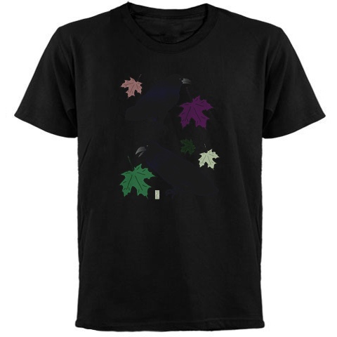
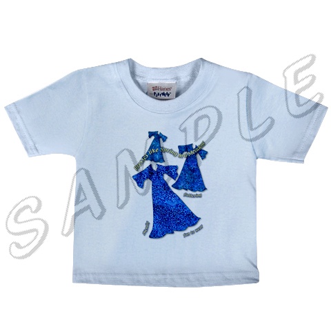
So I could have printed enough for a bedspread or wall-hanging, or a designer dress! Or sell the design to a digital printer who wants to make commercial yardage. At a minimum I'm going to upload a high-resolution version to my Cafepress store, WRW Color by Design and put it on a throw pillow with black borders, since I'd love to have one of them. And maybe a black tee-shirt…

Labels: , , , , , ,

Sunday, January 21, 2007

Global Warming T-shirt


This is my new design at my Cafepress shop, WRW Color by Design. I thought of the idea when I was wondering about buying a cute little batik stamp with a sun design on it, but at first I didn't think I'd use a worried sun. (Batik stamps are amazing — every expression you can imagine is on a sun face.) And then I thought, "What would a sun be worried about?"

This is a drawing rather than using a scan of the actual copper tjap, like I've done before. I did it in a brighter yellow and orange color, which works on white tees too, and light colors like the organic tee. But I like the lighter color too, which looks more like batik on the darker tees, like this green.


Long ago I was an Oceanography major. The idea of a few degrees warmer temperatures in the oceans sounds minimal and is catastrophic. Plankton, which are the basis of most food chains in the sea, live at specific temperatures. They can't migrate.

Warmer water holds less oxygen for fish & invertebrates to use. Stopping the sinking of cold, oxygen-rich water around Antarctica doesn't just mean stopping the climate conveyor belt that warms Europe. It means those deep seafloor waters have less oxygen. And it stops the upwelling of cold nutrient-rich water off South America that used to support major fisheries. Fisheries are already crashing all over the world, mostly from overfishing.* This won't help.

*And penguins are starving both from lack of fish due to overfishing (in the Falklands), and from icebergs blocking their path to the sea (in Antarctica). Warmer seas mean more icebergs breaking off. And nutrient-poor water means less plankton and even fewer fish.

No wonder the sun is worried.

Labels: , , , , ,

Wednesday, November 29, 2006

Another Cafepress print comparison


After Cafepress' recent announcement that Value tees will now only be heat transfer, I was reminded to publish another comparison of the results of the printing methods. This design, which I have shown before, I had printed both ways. The heat transfer, on the right, is brighter and clearer, and in this case, pretty true to the origninal colors, which can be seen at http://www.cafepress.com/wrwcolors/1263976.


I'm just disappointed because I had been experimenting with overdyeing my Cafepress direct print tees, and it was being fun and successful, and I liked value tees for it. I'm not sure yet if the technique will work for heat transfer.

Here is the image on a mug. I just put it on the scanner, then played with the colors a little in Photoshop to get them to look as close to the mug in my hand as I could. As with other images, it comes out bluer and darker on the mug. I have a lighter version I did for the black tee, so I'm going to switch images, I think.

Labels: ,

Tuesday, November 21, 2006

Baby Sea Turtles virtual batik


This is a new design I just finished. Virtual batik, which I think I invented, is based on a real copper batik stamp. I scan it, in a darkened room with the cover up, to get a dark background. Then it goes into Photoshop for some playing with color to get nice bright light colors, that will shine against a dark background, like real batik. In this case, the design is meant for the new dark colored tees that Cafepress has just added. Some colors, like this one, look brighter on the web than they will in print. Others, like the gold, proof pretty bright, so they might print that way on tees too.

It was only while I was working on this, making about a dozen colors, that I realized how appropriate it is for a crawling age baby. But of course any sea turtle friend should also like them. The other colors are coming, I only have two up so far, at WRW Color by Design. Next I have to do the mama sea turtles. Since I don't have an adult sea turtle stamp, that will be a little trickier… Photoshop here I come.

Labels: , , ,

Thursday, November 16, 2006

Quoth the Raven, "Nevermore"


While I was walking down the hill from school last week or so, I heard a musical, liquid chuckling noise from behind and above me; the noise perhaps that is described as like molasses gurgling out of a jug. I looked back, and there was a raven sitting on the lamppost I had just walked under. It was a most unexpected noise from that source, though maybe I had read about it and forgotten. I tried to take a picture, though none came out well enough to use, but they did show clearly enough the shape of the bill and the curve of the throat feathers, so I could be sure it was a raven. And when it flew, the angle of the tail confirmed it.

I had learnt those details about ravens while researching to do these drawings of them for a class last spring. At that time, I had not seen any close by, but they've been in the yard since, sitting in the trees quite close to the window. Still no pictures — they fly away when I open the window to try. They're too smart for me.

When Cafepress brought out these new colorful tees, and I started putting my designs on them, the ravens came to mind. I had not originally put any ravens on kids tees, thinking "Who'd want to put pictures of ravens on their kids?" Then I thought about Poe's raven, who said "Nevermore", and it reminded me of a 2-year-old who has just discovered the power of saying "No".

(In an "ontogeny recapitulates phylogeny' sort of cultural evolution, that seems to be similar to the power discovered by the medieval Arabic mathemeticians who discovered the concept of zero.)

And it seemed to me that having the raven to symbolize that eternal No might be funny. (My little niece is just two, so I am thinking about this.)


And then I thought about the holiday curmudgeon type of family member, who might appreciate a raven t-shirt as camouflage and defense against, and comment on, the seasonal festivities. These new dark tees are perfect for that, especially this green. The Fall-colored raven drawing looks almost cheerful on the new women's brown tee. Especially in comparison to the almost sinister look of the Spring-colored raven with the green leaves on the green tee.

And I'm still wondering, since I haven't ordered one to try it out, if the rather blue-black raven feathers would show in an interesting way against the black tee. Perhaps people who would like that would prefer that there not be any of those confounded colorful leaves to interrupt their black gloom. I might have to try a version of that.

Labels: , , ,

Thursday, November 09, 2006

Serendipity 1


After I made this design, the virtual batik I showed earlier, I designed a dress using it on a sage background, in the brochure for the publication design course. And now, Cafepress has surprised us with some new colors of t-shirts, and one is this green! I may have to have this…

Of course, as I go back and add designs to new colored tees, I'm finding other pictures that are great on the new colors too. Such a treat to have colors, not just white. I got so desperate for color that I'm overdyeing many of mine. I can get my favorite colors that way, but it's time consuming.


Here are some more tempting combinations that I found today. For some reason I really like the bright blue and yellow of my Dresses like Spring picture on this green. And the lilac Himalayan Poppy is perfect on this green; the leaves go with it and the flowers are contrasting colors.


The brown tee is the new women's long sleeve tee, and the poppy works well on it. And the stained glass style Sunset Marsh design looks like it will be good on the navy color.

Labels: , , ,

Thursday, October 19, 2006

Four Horses Batik Design is done

I put it on the new dark red tee, as well as the black tee, which should look like a real batik instead of a digital one. And with a clear background, it went on lots of other tees, including kids' tees and the organic t-shirt. And on a tote bag and throw pillow. Here it is in three different looks. I'm thinking of doing a couple of other color combinations as well as the blue & black it's in now. Maybe a purple & black that will work well on the red and pink tees. And a gold and black.

The other exciting tjap I got was a baby sea turtle! It's going to have to become a real batik, of the baby turtles going out to sea. Especially since I did a mother sea turtle design last spring, with all the mother sea turtles coming ashore. I did not like the quality of my attempt to do the design in a water based resist to create an effect like batik. I'll try it again in real batik to see if I can get finer lines. And as well as a batik picture, it will be fun to do some yardage for a dress or long vest.

Then, once they're batiks, I'll photograph them for a couple of tees.


Labels: ,

Tuesday, October 10, 2006

Don't be a goose


Here's the other political animal tee I did last weekend. This one was the same process: think of how to use the animal picture I had taken, extract the image, put it into Illustrator, in this case, to add the text, choose appropriate typefaces for the flavor of the message. I had already extracted the turkey for the Ben Franklin tee, so it was available when I thought of what I wanted for the back.

How I got the turkey picture is kind of funny. There are wild turkeys here. Sometimes two or three, or I've seen up to seven in a flock, will be coming through the yard every day for a while, scratching everything up. When they vanish, I never know if the coyotes, who also sometimes walk through the yard in the middle of the day, got them, or if they just left. But it's never been possible to get very close to them. I had seen some interesting interactions with the cats, some of whom hunted for a living before I got them. Some of the cats seemed to think the turkeys might be huntable; others seemed afraid of them (smarter, considering the relative sizes of turkey and cat).

Well, when I went to the quilt show at the fairgrounds last spring, over at the lunchroom building, there was this young turkey hanging out by the back door. I guessed that the seniors who have lunch there during the week, had been giving it handouts — and it was waiting for its lunch! Anyway, it came right up to the door, and didn't leave when a couple of us went out, so I had a chance to get a good picture.

The dog picture from the other day, he was funny too. He was barking furiously as we walked by, and I thought I'd like a picture of a barking dog. But every time I pressed the shutter, he had his mouth closed and was just staring at me. He should have been a politician — he'd never be caught in the act. It was appropriate to use him on a political t-shirt. Here's the goose design on a cap sleeve tee.

Labels:

Monday, October 09, 2006

New political tee designs


This weekend I thought of and made two new images for political t-shirts. And I did an ad (my first) over at Making Light, my favorite place to spend hours reading comments. Animals with Attitude—political opinions that bite. I had the pictures of the animals from last spring, just had to extract them, and I was thinking of how to use them…and there it was. The Disappeared Dog was the first. I thought the image was exactly appropriate for the idea. And I love the back of the tee. (Of course, one's own newest design is always the best thing ever.) When I get one for myself, I'll probably overdye it — white t-shirts just aren't very wearable. Sometime in the next year, Cafepress may start having more colored tees, but in the meantime, I'm enjoying my dyed ones. And especially the muted retro colors I get because of the process I use to not damage the image.

Here is the Disappeared Dog on a women's tee. I might have to Photoshop out that leash, if it's too distracting. I'm thinking about it for a little while.The second one was the Don't be a Goose tee. I'll maybe write more about it later.

Labels:

Friday, October 06, 2006

Cafepress printing colors


Bonus post today about Cafepress t-shirt printing colors. This first picture is of two infant tees. The one on the left is heat transfer, the right is direct print. The heat transfer is brighter but bluer. The direct print is actually closer to the colors of the original image, just a little softer. See the originals of these designs

  • here
  • in the first products, just below the sections.

    The next picture is the sunset color of the honeybee on a gray hooded sweatshirt. The colors are quite true to the original image. The third picture is of the same image on a journal, except it had a warm peach background.


    The light green of the honeybee and even lighter greenish white of the background are the way it actually came out. The center is a true white. Overall the colors are much bluer than the original. Obviously I'm going to remove this item - green honeybees are not going to be very acceptable. I left it up for everybody to see.

    What I'm really doing today is playing with overdyeing some Cafepress shirts, just to wear myself. My first test was great, and I'm looking forward to more. When they're done, I'll post some pictures and instructions, for anyone who might want to try it.

    Labels:

    Wednesday, October 04, 2006

    Peacock Album


    Over at Dressaday I said I would write more about wearing wide sleeves, but it's not going to be tonight. Since I failed to find a photo I can use in my files, I'll need to wait for daylight and photograph a dress or few.

    Meanwhile, here's a bonus image, just because I came across this one while I was looking for a version of the costume pic. Did this in Photoshop class last summer. The images are made on a scanner. Wouldn't it be lovely to be able to get fabric like this? I can print on 8.5x11 pieces of fabric, of course. I'm thinking of taking two of these (with the second one reversed) and putting them on the bodice or yoke of a dress. Full-length, maybe dark peacock blue?

    Or I know - I think I still have some very dark green panné velvet, with a diamondish textured pattern. If I scan that, I could use it as a background for the peacock feathers, print that, and use it on a dress made of the green fabric. That would be fun.

    I added the images from the last 2 posts to some t-shirts and things at Cafepress. I like the flowery Mead tote, and there are some tees as well. And the three dresses without the background went on some tees, including these new colored infant tees. This design, though it looks good on blue as well as white, would probably have to be for non color-coded kids. Not too many people would put pictures of dresses on their little boys. But as someone who hated pink, even as a kid, I wonder if some would like the blue tee, as well as pink & white, for their little girls.


    I'm experimenting with overdying the printed Cafepress tees without ruining the design. So far it's working very well, and I'm liking the dusty muted colors I get because of the technique I'm using. If only the warm dyeing weather had lasted a few weeks longer. Most years I'd have another two to four weeks, and in the last few years this has been prime dyeing and dye-painting season. Every afternoon after work or school for a month. The leaves for leaf-dyes haven't even started to fall.

    Labels: , , ,