Color Compositions
 Below is my comment at Dressaday 10-22-06 (And Shoes), where Erin asked if we had the recommended two or three color wardrobe. Lots of wonderful colorful answers.
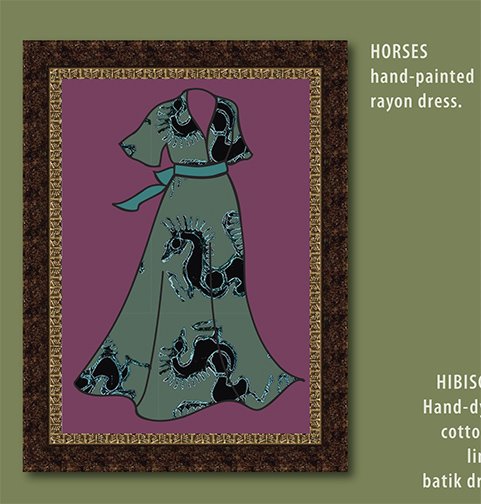
This picture is an example of a couple of the color principles I've listed below:
#1—two similar colors fighting with each other rather than working together. The shades of sage and aqua on the dress do, I think, go together well, but it was hard to find the exact shades that would. They are also an example of a potential fade-into-the-wallpaper muted combination.
#5—The red-violet background to the sage-&-aqua dress is an example of the muted complimentary combination, in which the colors brighten each other to our eyes, but the total is still not too bright for those who prefer mixed, muted colors
#1—The background yellow-green and the sage are a definite example of similar colors which really don't work together. In Chevreul's words they "injure" each other.
MinaW said
"I used to have only a few colors — bluegreens especially — in my closet. I also used to be so pale that black, grey, or the brights like orange made me look like a dead fish-belly, so my choices were somewhat limited. (The only sort-of-brights I could wear were very mixed: peach, aqua, violet.)
Then I started dyeing fabric and clothes, and my choices expanded to new favorites I hadn't even known were possible. And I took color theory, and learned how to combine any colors, even previous unfavorites, in ways I liked.
A couple of things I've learned:
1—If your closet only has shades of one or a few colors they don't all go together! Too close shades of the same color can often fight, not enhance each other. This is true of black or grey or white too.
2—Neutrals like gray have color in them too, it's just hard to see what it is. But put two greys next to each other; one might go green, the other red, and you can see what the underlying shade is. (I discovered this working in a carpet store, where a whole houseful of something that turned out to be an unexpected green-gray or pink-grey could be a disaster. (Especially when the couch or wallpaper it was chosen to go with went the other way.)
3—For those who have lots of shades of one or a few colors in your wardrobe, where it might be hard to find a cardigan or jacket that goes with them, go to a complimentary color. When I had mostly blue-greens, and started branching out, a muted purple or red-violet went with everything in the closet.
4—Don't stress about not knowing the color wheel and what's a complimentary color. The color wheels are all wrong anyway. Use your eyes; choose a contrast you like the look of.
5—If like me, you tend to prefer somewhat muted colors, and worry that you fade into the wallpaper… you may be very pleased with the muted-contrast combination. Choose your favorite muted color. Now go to an approximately opposite color, and choose a muted version you like. The two, being sort-of opposites, will make each other brighter to the eye, and yet not be so bright they scare you.
6—A trick from quilting: choose prints which contain colors you like to wear together. Then it suggests a whole bunch of combinations, and goes with lots of your clothes. Just don't make the corollary quilter's error and get too boring by being monochrome (all shades of one color) with no contrast.
7—The stategy of having neutrals in skirts, and colors in tops, like someone mentioned, can make bringing in colors easy. As a roommate & I discovered long ago, a flattering neutral can be a duller version of your hair color.
8—The idea of a key piece of jewelry or garment like a patterned skirt or decorated jacket, with a collection of colors you like, is a great way to tie an outfit, a wardrobe, or a suitcase-full of clothes together." (India & Oracle mentioned this strategy)
9—And the one I didn't say there, 'cause it seemed to be getting into too much color theory, is that all colors with similar amounts of grey in them go together, but it's much trickier to put them with colors with different amounts:
A—Pastels all go together, and white is the neutral that goes with them. Grey and black make the pastels look washed out. So do brights.
B—The rich jewel tones go together, and work with black beautifully. They shine against it. This includes gold.
C—The pure color-wheel colors go together, and they work with black or white. These are very bright combinations. For a little more harmony, use fewer of them: blue & yellow. And/or use related ones: orange & red or blue & purple. Also, using white with them, like using white flowers in a garden, can tone down some of these blinding combinations.
D—The muted, mixed colors go together, and will work well with greys. Use the opposites or near-compliments together to avoid too dull an effect.
And the one that only Chevreul, of all the color theorists, mentions. (He first proposed most of the major color harmonies, and especially figured out simultaneous contrast, in which colors next to each other cast an afterimage of their opposites on the colors next to them.) The colors that most theorist just call analogous — the colors that are next to each other on the wheel — most just say they go together. Chevreul saw that two of these which were too similar "injured" each other. Of course, he was using a color wheel with about 10 times as many colors as most, so he was truly looking at similar colors. And he gave the solution to using them together:
10—To put together very similar colors, make one darker, the other lighter, to add contrast. Or even make one a mid-greyed tone, and the other light or dark and purer.
Long ago, when I met the first other person who had my name, she turned out to be the most eccentric old lady one could ever wish to live up to. And she believed that as one got older, our colors should get brighter. Very much brighter.
Labels: clothing design, color, dresses, fabric design
posted by MinaW @ 10:20 PM
2 comments
![]()
2 Comments:
I've found that waaay too many people think that black is just black - I find it gruesome when someone wears a black with a red undertone together with a black with a green undertone!
I've found that one of the best ways to find out if two different black articles are in the same undertone family is to look at the garments next to each other, through sunglasses. You know how some sunglasses change the colours in people's clothes just a little bit? It's usually just enough to make two black garments, if they have different base colours, look radically different.
Do you really think that brights wash out pastels? I find I love pink with red, and lavender with purple. Of course, it does have to be ... the right shade of each! Which is pretty much the point of your post, after all. :)
LaBelladonna — What I think of as "my" color combination, (and Chevreul is the only color theorist who mentions it) is two colors which are right next to each other on the wheel. (The wheel needs to have at least 24 or 48 colors.) Then one is lighter and the other is darker, and one brighter, the other more muted. They have to be exactly right all right.
About brights and pastels, I'm guessing that a lot of the pastel with a little of the bright will be more successful than a bright background with pastel dots. The simultaneous contrast effect of the contasting color afterimage cast on the neighboring color (which is what dulls it) will be stronger if cast by a bright color than by a pastel.
Do you use light and dark and bright shades of the exact same hue? Monochromatic is a classic color harmony that's supposed to work. I think that proportions and and contrast and having the exact shade may be important. I've definitely seen quilts that ended by being very dull.
That's a great tip about the sunglasses. Maybe the quilter's red plastic thing that you look through to see value would work too?
My opinions about brights and pastels and greyed tones, jewel tones, etc, and the neutrals they go with were worked out by eye, long before I took color theory, and I haven't revisited them to check if I find any exceptions. Time to do that.
Mina
Post a Comment
<< Home