Wednesday, May 06, 2020

Definitely time to sew again...

Empire-style dress design drawn for a costume history class in 2016

But not with a patterned fabric used like this batik-style one, although I just made over 2 dozen versions of this design in colorful new incarnations.

I have been falling for wonderful linen fabrics, which come also in the soft greyed colors which are my favorites, as well as brighter colors. And some of my favorite fabric designs go with some of those linen colors.

So, the parts of this picture with the patterns will be solid colors of linen, with a pattern on the front of the bodice.


Maybe one of those 2-Sprig colorings I just made. This version of the design fits more closely together, and has some interesting layouts.


You can see that these textured designs look like embroidery.  So for me, they seem more appropriate for smaller areas like a bodice front.


Time to start making something...

When I was in school the first time, 50 years ago, I used to draw the costume I was going to make during vacation, and prop it up on my desk to look at while I studied for finals. I find this drawing has the same effect. I keep looking at it.
 

Labels: , , , , , , , , , , , , , , , , ,

Wednesday, April 22, 2020

Time to Sew Again 2020

My 2-sprig textile design
from part of a copper batik stamp


I am cleaning up my sewing room, and organizing the fabrics I have on hand for the top 20 or so projects I have in mind. (Of which if I get 2 or 3 made, I'll be very happy.) I want to alter/make a couple of patterns, for a linen tank top to replace the one I used for sleeping for many years. And a linen princess-line tunic to go with my favorite multi-color long skirt, which I plan to embellish with card-weaving (time to get back to doing that too) along the seams. And from that a pattern for linen tunics/dresses with a bodice panel from one of my textile design fabrics. Maybe a Viking costume with card-weaving. . .

I have plenty of fabric on hand, linen and my (and Amy Vail's) textiles, a few pre-washed, for the first few projects. Time to get a washing machine again, once it is possible. Linens are beautiful, soft and strong, but definitely need to be pre-washed several times.

Here's another of the Empire/Regency inspired clothing designs I did several years ago for a Costume History/Fashion History class, using textile designs I did for the project.

Empire-inspired dress design
using my textile designs

It will be fun to get back to doing one of my favorite things. Maybe roses next. . .

Labels: , , , , , , , , , , , , , , , ,

Friday, September 19, 2014

More Nomad Dress Ideas (Folkwear#107)

Batik-look version of the Nomad Dress

This mock-up version of the Folkwear #107 Afghani Nomad Dress is made from some of my virtual-batik fabric designs at Spoonflower, a print-on-demand fabric designers' site. Although I have tested these 2 designs shown, the Arts and Crafts Deer and Grapes design, and the 2-Sprig design, the deer in quite a few colors, I have not yet made them in the same color, as shown here. This color prints as a deep rich Aquamarine.

 Love Explosion fabrics version of Nomad dress Folkwear#107

This is a more brightly-colored and multi-fabric mock-up, using some of my computer drawn quilting fabric designs. Of these, the hearts and the maple leaves are available, but the Love Explosion and this new color of my 2-Papercuts design I have not yet tried out. But this gives an idea how combining brighter colors would look. The hearts as shown here is a larger version than I tested, I think, but these vector designs can be made any size.

Soon I'll be ready to show the fabrics I'm working on now, derived from the copper batik stamps I just got, and others, which I am making into virtual embroideries instead of virtual batiks, and with textured backgrounds.

Labels: , , , , , , , , , , , , ,

Tuesday, June 03, 2014

Empire Inspired Dress Design with my Fabric

Empire-waist dress in Regency Stripe fabric, dark bluegreen

Regency-inspired dresses and fabrics April 2014 (written 4/16/2014)

This spring I was taking a costume history (fashion history) class. And one assignment we had was to design some modern clothing inspired by a historical period.

In the days when I was an active Society for Creative Anachronism member, I designed, drew patterns for, and made 12th century and Renaissance clothes for myself. But for this assignment, I decided to do Empire/Regency inspired designs, since I knew from my long-ago experience that those dresses, if cut right, could be flattering. If not, like the granny dress revival from the 60s, they can look like a sack of potatos tied with a string.

The secret, also mostly not apparently known by the designers of recent empire-waist tops, is that they have to flare from that high waist, not be cut straight.

The fun thing about doing this type of assignment today is the great research possibilities for the historical references. Even the current costume books may have larger color pictures, compared to 20th century ones. But of course, the internet sources are the great difference.

Turns out there are thriving Regency/Jane Austen communities out there, including commercial patterns drawn to re-create real period designs, which have to be worn over period underthings or they won't fit. (No wonder some of the period paintings and drawings, like some by Ingres, don't look right in their proportions. Their stays pushed the bust way, way up.)

But of course, I was doing modern clothes designs, in fact, things I might want to wear myself. And, since my clothes designing has always been fabric-driven, and since textile design is now my passion, first I had to design the fabrics...

Besides some overall prints, I wanted some border prints which might look like embroidery patterns. And I will be making engineered versions which can be placed around curved, flared hems and necklines, as well as straight for on sleeves.

This stripe is not like any period fabric, although maybe it has a little rococo flavor. But I like it on this dress. I designed it smaller, but liked the effect when I stretched it larger to put on the drawing, so I made a larger version of the fabric too. There's a link on the picture to one of the fabric pages at Spoonflower. I will be making one even taller too, and soon this large-scale darker one with a textured background will be available.


**Other versions coming, including border prints which look fairly in period, one based on a vintage copper batik stamp.

And, I'm working on some fabrics to recreate the big surprise I found in my research - shawl dresses in rich colors with deep borders, made from imported Kashmir shawls, or the European copies made in merino wool. Josephine had several. They weren't always wearing those drafty transparent white muslins...

Labels: , , , , , , , , , , , , , , ,

Sunday, September 16, 2007

The most flattering skirt pattern


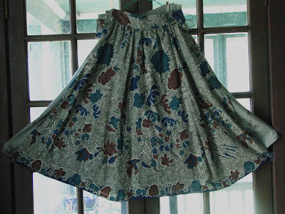
This cut of skirt has been the most flattering for me over a range of 6 or 7 sizes, from this knee-length to floor length, and in fabrics from this light batik to heavy denim or velveteen. And I discovered it by accident while making this skirt, because I wanted to use the border print at the hem. As you can see, that didn't work perfectly, but the cut of the skirt turned out really well. (It is a weird number of gores, like 5 or 7, because of how much fabric I had. And it is cut across the fabric, because of the border print, which ran down both selvedges.)

Basically this cut is:

Twice your waist measurement, plus seam allowances for each gore, gathered, pleated, or elastic-gathered down to waist size.

Four times your waist, plus seam allowances for each gore, at the hem. That is, each gore is twice the width at the hem that it is cut at the waist, then the waist is gathered to 1/4 the hem width.

This cut of skirt, with at least this much flare, is flattering and fun to wear. Especially in the longer lengths, it flows around my ankles as I walk. For a good long skirt, I figure at least 120 inches hem circumference. You will find this type of skirt moves very differently from a straight-cut, gathered-at-the-waist dirndl skirt, which is unflattering on almost anyone. The gathers or pleats or elastic at the waist makes this more forgiving to wear than a simpler fitted at the waist, flared skirt.

Labels:

Thursday, September 13, 2007

Gorgeous dresses everywhere


I had to look at the Fashion Week shows for spring 2008 for a textiles class. And there are, dresses everywhere, hooray. These costumy Mermaids-in-the-waves are by Zac Posen. What gorgeous hand-painted fabrics!

elle.com is a good place to check them all out. There's a discussion over at Dressaday about some beautiful and wearable dresses by Derek Lam.

But lots of other designers are showing dresses this season, many in great patterned fabrics, others solids including a beautiful indigo.

Take a look at Donna Karan, DKNY, Diane von Furstenberg, Calvin Klein . . . and lots of others. I'll add more names as I find them.

(This picture, unlike all others on this blog, is not mine. Maybe I'll replace it with a drawing soon.)

Labels: , ,

Friday, November 10, 2006

If you would make it, I would buy it & dye it

This is a copy of a letter I just sent to Dharma Trading, my favorite dye supply house for all the dyeable clothing they have. It's wonderful to have clothing available that I can have in any of my favorite colors, just by dyeing it. (Of course, I've spent half-a-dozen years working out recipes for those favorites.) I like several of their dresses, skirts, and shirts, but there are some favorite styles they don't carry.


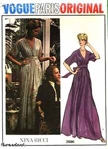
Dear Dharma folks — I have been meaning to write you with some style requests for years. Now some of the styles I wanted are everywhere this year, and if I had written you, who knows, you might have already had them. Two things I especially wanted are full-length wrap or surplice dresses, and empire-waist tie-back dresses with flared skirts. (Also a full-length princess dress like the one you have.) Set-in or cut-on kimono sleeves. Ankle-length at least after shrinkage, with a minimum hem circumference of 120 inches or so. And please include long-sleeve versions for dressy winter dresses.

And plus sizes of course. Especially the empire-waist with flared skirts. That is the most flattering style of all time on women of ample construction. I noticed that a long time ago, when I was very slender waisted, and loaned a costume to a woman much larger, who looked fantastic in it. The flared skirts make or break the design. Do you remember granny dresses from the late 60s? They were empire-waisted but straight-cut, and had that classic sack-of-potatoes-tied-with-a-string look.

The Vogue pattern picture (top of page) is of a vintage pattern, not current, unfortunately. It seems that the waist is at the waist in the photo, but in the drawing, the altered proportions make it more like an empire waist. Notice how the drawing makes the skirt even more flared (besides the taller-&-thinner-than-human thing). They always seem to make the skirts more flared in the pictures, to make the dress look better. I say, why not cut the dress for real like that in the first place?

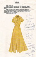
Do you collect old Peterman catalogs? I have a stack of them in my style notebook, with pages marked. Those classic styles keep reappearing. Here's a scan of one, a surplice waist long dress. I'd rather not have the front slit, but it'd be gorgeous on someone young. The advantage of a real wrap would be that it opens flat and could be dye painted or leaf-dyed, not just dyed.

The second picture is of a wrap-top I actually bought. It is my favorite thing for a dressy winter outfit in other people's warm houses. I'd like a dozen more in all my favorite dye colors.


I'm in the process of making myself some new patterns, starting with commercial ones and combining & changing them, to make lined-reversible wrap and empire dresses. I plan to make them with hand-dyed and commercial batiks, to start with. If you made them, I could just buy them & dye them. Please?

Do I have a stack of white clothing already waiting? … Don't ask how big. I wanted to say, however, that your new Berkeley shirt is great. Just what I was looking for to wear to work. I'll probably be ready for another half-dozen soon. I think I might pleat the shoulder though, after dyeing.

I hope you'll email me back saying that you already have those styles in development, and didn't need this request. But now that I've started, I'll probably continue to bug you with requests. Are there any dye-able karate jackets out there?

Your very faithful and appreciative customer,
Mina Wagner

Labels: , ,

Thursday, November 09, 2006

Serendipity 1


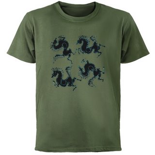
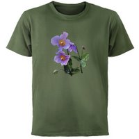
After I made this design, the virtual batik I showed earlier, I designed a dress using it on a sage background, in the brochure for the publication design course. And now, Cafepress has surprised us with some new colors of t-shirts, and one is this green! I may have to have this…

Of course, as I go back and add designs to new colored tees, I'm finding other pictures that are great on the new colors too. Such a treat to have colors, not just white. I got so desperate for color that I'm overdyeing many of mine. I can get my favorite colors that way, but it's time consuming.


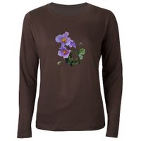
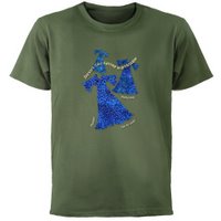
Here are some more tempting combinations that I found today. For some reason I really like the bright blue and yellow of my Dresses like Spring picture on this green. And the lilac Himalayan Poppy is perfect on this green; the leaves go with it and the flowers are contrasting colors.


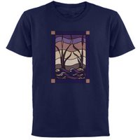
The brown tee is the new women's long sleeve tee, and the poppy works well on it. And the stained glass style Sunset Marsh design looks like it will be good on the navy color.

Labels: , , ,

Friday, October 27, 2006

I'm really going to have to make some of these dresses


Well, I really am. This project is finished now, and after making the pictures, and writing about these imaginary dresses (it's a publication design class, not fashion design), I am so invested in the idea I really do have to make some. Work out the patterns, at least. Prove that I can do something so flattering. Use some commercial batik fabric, at first. Make some lined reversible skirts and wrap tops. Get the dress patterns right. Then do some hand batik fabrics for them — or batik the dress just before sewing up the side seams.

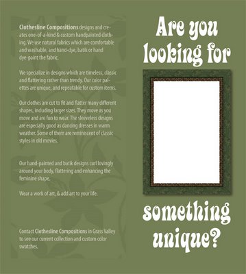
In case it isn't legible, my glowing imaginary description reads:

Are You Looking for Something Unique?

Clothesline Compositions designs and creates one-of-a-kind & custom handpainted clothing. We use natural fabrics which are comfortable and washable, and hand-dye, batik, or hand dye-paint the fabric.

We specialize in designs which are timeless, classic and flattering rather than trendy. Our color palettes are unique, and repeatable for custom items.

Our clothes are cut to fit and flatter many different shapes, including larger sizes. They move as you move and are fun to wear. The sleeveless designs are especially good as dancing dresses in warm weather. Some of them are reminiscent of classic styles in old movies.

Our hand-painted and batik designs curl lovingly around your body, flattering and enhancing the feminine shape.

Wear a work of art, & add art to your life.


Do you wonder that I want some of these? Now that I have imagined them, I have to have them.

Labels: , ,

Monday, October 23, 2006

Color Compositions

Below is my comment at Dressaday 10-22-06 (And Shoes), where Erin asked if we had the recommended two or three color wardrobe. Lots of wonderful colorful answers.

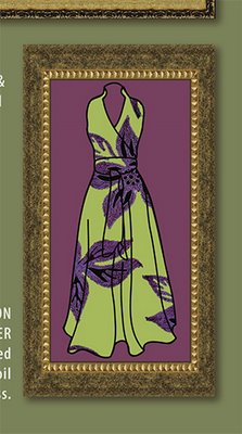
This picture is an example of a couple of the color principles I've listed below:
#1—two similar colors fighting with each other rather than working together. The shades of sage and aqua on the dress do, I think, go together well, but it was hard to find the exact shades that would. They are also an example of a potential fade-into-the-wallpaper muted combination.
#5—The red-violet background to the sage-&-aqua dress is an example of the muted complimentary combination, in which the colors brighten each other to our eyes, but the total is still not too bright for those who prefer mixed, muted colors
#1—The background yellow-green and the sage are a definite example of similar colors which really don't work together. In Chevreul's words they "injure" each other.

MinaW said

"I used to have only a few colors — bluegreens especially — in my closet. I also used to be so pale that black, grey, or the brights like orange made me look like a dead fish-belly, so my choices were somewhat limited. (The only sort-of-brights I could wear were very mixed: peach, aqua, violet.)

Then I started dyeing fabric and clothes, and my choices expanded to new favorites I hadn't even known were possible. And I took color theory, and learned how to combine any colors, even previous unfavorites, in ways I liked.

A couple of things I've learned:
1—If your closet only has shades of one or a few colors they don't all go together! Too close shades of the same color can often fight, not enhance each other. This is true of black or grey or white too.
2—Neutrals like gray have color in them too, it's just hard to see what it is. But put two greys next to each other; one might go green, the other red, and you can see what the underlying shade is. (I discovered this working in a carpet store, where a whole houseful of something that turned out to be an unexpected green-gray or pink-grey could be a disaster. (Especially when the couch or wallpaper it was chosen to go with went the other way.)
3—For those who have lots of shades of one or a few colors in your wardrobe, where it might be hard to find a cardigan or jacket that goes with them, go to a complimentary color. When I had mostly blue-greens, and started branching out, a muted purple or red-violet went with everything in the closet.
4—Don't stress about not knowing the color wheel and what's a complimentary color. The color wheels are all wrong anyway. Use your eyes; choose a contrast you like the look of.
5—If like me, you tend to prefer somewhat muted colors, and worry that you fade into the wallpaper… you may be very pleased with the muted-contrast combination. Choose your favorite muted color. Now go to an approximately opposite color, and choose a muted version you like. The two, being sort-of opposites, will make each other brighter to the eye, and yet not be so bright they scare you.
6—A trick from quilting: choose prints which contain colors you like to wear together. Then it suggests a whole bunch of combinations, and goes with lots of your clothes. Just don't make the corollary quilter's error and get too boring by being monochrome (all shades of one color) with no contrast.
7—The stategy of having neutrals in skirts, and colors in tops, like someone mentioned, can make bringing in colors easy. As a roommate & I discovered long ago, a flattering neutral can be a duller version of your hair color.
8—The idea of a key piece of jewelry or garment like a patterned skirt or decorated jacket, with a collection of colors you like, is a great way to tie an outfit, a wardrobe, or a suitcase-full of clothes together." (India & Oracle mentioned this strategy)

9—And the one I didn't say there, 'cause it seemed to be getting into too much color theory, is that all colors with similar amounts of grey in them go together, but it's much trickier to put them with colors with different amounts:
A—Pastels all go together, and white is the neutral that goes with them. Grey and black make the pastels look washed out. So do brights.
B—The rich jewel tones go together, and work with black beautifully. They shine against it. This includes gold.
C—The pure color-wheel colors go together, and they work with black or white. These are very bright combinations. For a little more harmony, use fewer of them: blue & yellow. And/or use related ones: orange & red or blue & purple. Also, using white with them, like using white flowers in a garden, can tone down some of these blinding combinations.
D—The muted, mixed colors go together, and will work well with greys. Use the opposites or near-compliments together to avoid too dull an effect.

And the one that only Chevreul, of all the color theorists, mentions. (He first proposed most of the major color harmonies, and especially figured out simultaneous contrast, in which colors next to each other cast an afterimage of their opposites on the colors next to them.) The colors that most theorist just call analogous — the colors that are next to each other on the wheel — most just say they go together. Chevreul saw that two of these which were too similar "injured" each other. Of course, he was using a color wheel with about 10 times as many colors as most, so he was truly looking at similar colors. And he gave the solution to using them together:
10—To put together very similar colors, make one darker, the other lighter, to add contrast. Or even make one a mid-greyed tone, and the other light or dark and purer.

Long ago, when I met the first other person who had my name, she turned out to be the most eccentric old lady one could ever wish to live up to. And she believed that as one got older, our colors should get brighter. Very much brighter.

Labels: , , ,

Do you define yourself by what you wear?

I have come to think of clothing as an art form mostly* unconnected to the appearance of the person serving as the dress form inside it. This is very liberating as a personal dressing philosophy. If I'm showered and comfortable in what I'm wearing I certainly don't worry about the fashionability of the hem length. (Or how bright my newly-dyed t-shirt is.) I buy colors when they're in fashion, to wear during the long droughts when there aren't any colors I like.

And, because I notice clothing, I often compliment women on what they're wearing, whatever the size or shape of the woman inside. It could be their oldest sweater which is a great color (often I find they say that the garment I've noticed is old — I figure that means it's a favorite). I try to avoid personal comments, except maybe "It's a great color on you".

Often the piece I notice will be a large shirt in a great fabric. Super. I like them myself. And when dresses were showing up more and more, and I was working outside and wearing jeans and a uniform shirt, I was very happy to see everybody's options expanding.

Is this just California? One day I noticed in the hardware store, within half an hour, a lady in an ankle length dress, one in a flared black mini with striped tights, one in jeans and tatoos and muscles and a midriff-baring top, and a guy in jeans, a muted lime tunic, & peace symbol pendant. I love the freedom of expression available.

And notice that each of those send a different message to the viewer. The thing I realized years ago, after hearing that a friend had not gotten into medical school because she wouldn't wear a skirt to the interview, is that it's all costume. We can choose what message we send, and choose it differently each day. It does not define us, unless we let it.

*mostly unconnected to the appearance of the person serving as the dress form inside it Mostly because given my choice I'll prefer something which is cut to be flattering and easy to move in and well-fitted for comfort. And a color that when I was paler made me look like a dead fish-belly (like orange or black) did not make me comfortable.

This dress was drawn from a vintage pattern or dress that Erin showed over at Dressaday, with the large pattern to look like a hand-painted design.

The colors of this design are way outside my original comfort range, and I love them together. The color theory teacher was right; it's possible to use any colors and make them look good.

(These were my comments on "You don't have to be pretty", 10-19, at Dressaday.) More later.

Labels: , , ,

Friday, October 20, 2006

Art to Wear


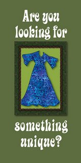
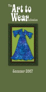
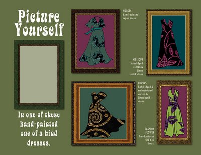
This is the cover of the brochure I just did for the publication design class. There's meant to be a die-cut hole that you look through to the picture of the dress. The next page that you see as you unfold the brochure is the title, Art to Wear. Then the inside of the brochure, which has the dresses.

I drew these dresses from vintage pattern designs and dresses, most of which I saw over at Dressaday. The designs are meant to simulate hand-painted and hand-dyed patterns, and I wanted to try out large scale patterns. I love the effect, especially the way the flower hugs the waist of the yellow-green dress. You'd never know that that and the black and red-violet above are the same pattern. What I used to give the effect of large hand-painted designs were the virtual batiks I showed below, used at a large scale compared to the size of the dresses.

The blank rectangle in the frame on the left side of the image is meant to be the die-cut hole, so there's nothing in the frame from that side.

The colors of this project are way outside my original comfort range, and I love them together. The color theory teacher was right; it's possible to use any colors and make them look good. And she was right that our use of colors would expand. I have some clothes that I never wore much, because they weren't my favorite colors, but just off. I thought I might try overdyeing them, but that's always a risk; one can easily ruin the garment. Now my color preferences are expanding, and I think I will just wear them and enjoy them. I have them because I liked the style in the first place.

And I love the effect of the large-scale patterns in this project so much that I think I'm going to have to design and dye some for real.

There's a great discussion over at Dressaday today: You don't have to be Pretty. Two of Erin's comments that I liked the most are: Prettiness is not a rent you pay for occupying a space marked "female". and I'm not saying that you SHOULDN'T be pretty if you want to. (You don't owe UN-prettiness to feminism, in other words.)

Some of my thoughts on that subject were: "I have come to think of clothing as an art form mostly unconnected to the appearance of the person serving as the dress form inside it. This is very liberating as a personal dressing philosophy." and "it's all costume. We can choose what message we send, and choose it differently each day. It does not define us, unless we let it."

There were lots of interesting comments on this too. I think I'll have to write about it more soon, maybe tomorrow.

Labels: , ,

Friday, October 13, 2006

Window shopping


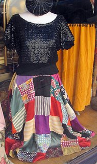
This great skirt, and sequined top, were in the window of a vintage clothing store in downtown Grass Valley. The skirt is patchwork squares of silky-looking fabrics. It is lined and reversible — I love lined & reversible clothes. The lining is a black with white polka-dots, I think she said. It looks like a circle skirt. What a difference from the plaid circle skirts that were in once, and again now. The owner said the waist is tiny, 23 or so.

The black sequined top is the right shape to go with a circle or other flared skirt. This fit, with the wide band fitting over the skirt below the waist, is the most flattering I remember finding to go with this cut of skirt. Cardigans too — I remember desperately wanting one this shape.

I don't covet either of these items; they certainly wouldn't fit me now. I posted them for the ideas they suggest. I would like to do the skirt in squares of commercial batik fabric, lined with hand-dyed fabric. For anyone who is on a swatch subscription list, this might be a great way to use those swatches. Six inch squares would do. This year, the skirt would also be interesting in squares of men's suiting fabrics. For those fond of polka dots, that seems like a great lining. Or hand-dyed flannel, for a winter skirt. Some of that is available commercially.

For anyone who might fit these, and who is interested, they are at
A la Mode Vintage, 127 Neal St, Grass Valley CA 95945.
(530) 272-1287 joankremmer@yahoo.com

PS The visible lines across the black square are window reflections — they continue across the yellow-orange to the right.

Labels: