Thursday, January 25, 2007

Dear Faithful Reader


(and occasional readers) I know you're out there, because of Statcounter. Perhaps you could get in touch and let me know what keeps you coming back, what you're looking for? Or why you don't come very often, what you're looking for? I write about lots of things. If I knew what interested you, perhaps there'd be more about those topics. If you'd rather email me than leave a comment, please put the blog name in the subject line.

Imagine me here at my desk writing to you. This is the day after I got my computer. It's on the Mission desk in Grandfather's house. I had been online first thing, and gotten an image of a batik fabric to use as a desktop. I call this image the "Arts and Crafts Computer". (Yes I know there's a book by that name.)

Over at Dressaday Erin tagged us all. Here's my 5 items of information about myself:

I finally met another person who dates historical events by what they were wearing. (Yes, she's a costumer.)

I live (for a few months more) in the house my mother was born in.

I learnt to sew in 5th grade in England, by hand.

I learnt to bake bread the summer I turned 16, on a wood stove at our cabin.

When I call my cats (mrrroowwwww), they come running. Through the sprinklers. To get to dinner. They have me trained to call them as soon as I come home, before dark. So the coyotes don't get them.

Labels: , , ,

Sunday, January 21, 2007

Global Warming T-shirt


This is my new design at my Cafepress shop, WRW Color by Design. I thought of the idea when I was wondering about buying a cute little batik stamp with a sun design on it, but at first I didn't think I'd use a worried sun. (Batik stamps are amazing — every expression you can imagine is on a sun face.) And then I thought, "What would a sun be worried about?"

This is a drawing rather than using a scan of the actual copper tjap, like I've done before. I did it in a brighter yellow and orange color, which works on white tees too, and light colors like the organic tee. But I like the lighter color too, which looks more like batik on the darker tees, like this green.


Long ago I was an Oceanography major. The idea of a few degrees warmer temperatures in the oceans sounds minimal and is catastrophic. Plankton, which are the basis of most food chains in the sea, live at specific temperatures. They can't migrate.

Warmer water holds less oxygen for fish & invertebrates to use. Stopping the sinking of cold, oxygen-rich water around Antarctica doesn't just mean stopping the climate conveyor belt that warms Europe. It means those deep seafloor waters have less oxygen. And it stops the upwelling of cold nutrient-rich water off South America that used to support major fisheries. Fisheries are already crashing all over the world, mostly from overfishing.* This won't help.

*And penguins are starving both from lack of fish due to overfishing (in the Falklands), and from icebergs blocking their path to the sea (in Antarctica). Warmer seas mean more icebergs breaking off. And nutrient-poor water means less plankton and even fewer fish.

No wonder the sun is worried.

Labels: , , , , ,

Sunday, January 07, 2007

Heraldic Design as Inspiration for Fabric Design


These are two papercut designs I did in the design class 2 years ago. The first was a counterchange assignment, and I love the way this floral lays out in an alternating stripe when it is repeated. Naturally for me, both designs turned out as fabric designs.

The second design was for a tessellation assignment, and since I am familiar with quilt-style tessellations, I wanted to do something more difficult than a standard based-on-a-square pattern. I also wanted to do something that looked floral, so I was happy with this trillium effect. After I turned this in I realized that by dividing the patches, I could have leaves & butterflies too, with this layout.

This second pattern is less obviously related to heraldic design, but heraldry uses tessellations in the "vair" and other fur designs. Counterchange is, of course, a common design effect in heraldry, one which is very effective. When I suggest heraldry as an inspiration for fabric and other surface designs, I mean not the heraldic lions or unicorns, (unless used as repeating patterns, which can be fun), but more that looking at some of the design strategies, like field divisions and counterchange, can be a rewarding source of inspiration.


Labels: ,

Thursday, January 04, 2007

I just read this color book

I just finished reading the best book about color mixing for artists, Blue & Yellow Don't Make Green by Michael Wilcox, and found his site, www.schoolofcolor.com and wrote him a letter.

Jan 1, 2007
Dear Michael Wilcox,

When I was in high school, I remember asking the physics teacher what made a material colored, what was the interaction between light and matter that produced color. His answer was "That's a good question" which my father decoded for me as saying that he didn't know the answer.

Since Dad was a physical chemist, he provided part of the answer: the energy of a photon of a particular wavelength of visible light must be matched by the energy absorbed by an electron as it jumps to an available space in a higher orbital shell. That is what physically happens when light is absorbed by material. The chemistry of this is different for each substance, and thus the wavelegths of light that can be absorbed. If the lesser energy released as it falls back into its original orbital shell is in the visible range, that is fluorescence.

I have always been interested in color; I wish I had pursued that interest further long ago.

I just finished reading Blue & Yellow Don't Make Green, which I had heard of when I took a color theory course several years ago. That course expanded my universe. You have just given it another dimension. I was excited to see the books shown in the back on Colour in Gardening & Quilting, and disappointed to not find them available yet.

As a fabric dyer, color mixing is one of my major interests. I started dyeing because I wanted to make a complex color wheel, useful for color choices in quilts & wearable art, and the colors were not available in fabrics. The whole process of dyeing and figuring out color mixes became totally absorbing, and quilting got forgotten. Now I am trying to set up a color mixing system of dye primaries for Procion MX fiber reactive dyes, to put on the web.

It is disappointing that almost all the books about color for quilters and fiber artists use the same old grade-school color wheel. I was working in a bookstore when one of them, Christine Barnes, was writing her book, and I pointed out to her the books on color theory by Jim Ames & Jose Parramon, which at least use a different three colors from red yellow & blue. She said she'd stick with the color mixing she was taught in school, rather than present any alternate ideas. So does everyone else, apparently, but perhaps partly because they don't know any alternative exists.

The best of the quilters writing on color that I've found, Joen Wolfrom, uses the Ives color wheel, with yellow, turquoise (cyan), and fuschia (or magenta) as the dye primaries. I still wasn't happy with the bland colors I could mix with those primaries, which are similar to printers primaries.

So I went to other color-mixing primaries, and also mixed from mixed colors, to get the rich jewel tones I like. Fiber reactive dye chemistry is different than paints, and the pigments are not the same, but your system of thought makes sense of the rich colors I could mix without being able to explain. (red + green = purple?) (violet-red + teal-green)

I can mix much richer dye colors than the gamut a printer can reproduce with a CMYK system. Now I have an idea why. Thank you.

Mina Wagner

For future articles that I would like to see:

Color as used in batik, which can involve many layers of dye application, and in which color planning is particularly important, would be of great interest to me. I have spent years developing a dye palette, but don't have all the colors of the rainbow figured out. Also, many layers of dyes complicates understanding the results. It's why I took color theory originally.

Also, enamel glazes on silver or gold involve rich depths and layers of color. There I have some design ideas, but without the years of recipes. A guide to the behavior of specific colors in mixes would be welcome.

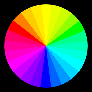
PS This isn't Michael Wilcox' color wheel, it's an RGB-CMY one I've been playing with.

Labels: ,

Monday, January 01, 2007

The fatal law of gravity


When you're down, everything falls on you.

Labels: ,