Wednesday, May 06, 2020

Definitely time to sew again...

Empire-style dress design drawn for a costume history class in 2016

But not with a patterned fabric used like this batik-style one, although I just made over 2 dozen versions of this design in colorful new incarnations.

I have been falling for wonderful linen fabrics, which come also in the soft greyed colors which are my favorites, as well as brighter colors. And some of my favorite fabric designs go with some of those linen colors.

So, the parts of this picture with the patterns will be solid colors of linen, with a pattern on the front of the bodice.


Maybe one of those 2-Sprig colorings I just made. This version of the design fits more closely together, and has some interesting layouts.


You can see that these textured designs look like embroidery.  So for me, they seem more appropriate for smaller areas like a bodice front.


Time to start making something...

When I was in school the first time, 50 years ago, I used to draw the costume I was going to make during vacation, and prop it up on my desk to look at while I studied for finals. I find this drawing has the same effect. I keep looking at it.
 

Labels: , , , , , , , , , , , , , , , , ,

Wednesday, January 03, 2018

Tablet-weaving / Card-weaving

One of my first learning projects, showing how you can make many patterns with one warp setup.


A new thing I researched and learned last year, and wrote an illustrated how-to paper on. And I really fell in love with it. The weaving process can be simple and quick (a few hours or days for a band). Or it can be very complex and time-consuming. I might not tackle those - my strength has always been to learn a simple technique, and then design complex patterns for it. And I am already doing that.

The technique is ancient (at least Roman, Viking, Anglo-Saxon, 1500BCE at Hallstatt, 1100BCE in Italy are recent discoveries), and related to weaving on the warp-weighted loom (which is at least neolithic in age). The woven bands can be very strong, "camel straps", or 1 cm wide delicate silk strips used for headbands (fillets), or clothing borders, sometimes woven-in. 

My enthusiasm for this is encouraging me to get involved again with the SCA (Society for Creative Anachronism), which I have always considered myself part of the community of, and make some clothing. Viking, Anglo-Saxon, 12th century London. . .

But of course, current retro/boho fashions are also the perfect place to wear these decorative bands. Wish I had run across it back in the day.


One of the things I was doing while I wasn't posting. (While I didn't have internet from home)

Labels: , , , , , , , , , , , , ,

Saturday, March 12, 2016

Rexie thinking about being a wildcat...

Bob In Tall Grass/ Rexie on painted chair
For a class assignment, I was putting together some presentation slides, and found some fun things looking through my images and photos. These  two cats were similar ages, still visibly young, although not kittens anymore, when these photos were originally taken.
Bob, being wild out in the grass, has been Photoshopped, using a filter.

Pure serendipity that I found them and saw how to put them together.

Doesn't Rexie look like he is dreaming about being wild?

Labels: , , , , , , ,

Tuesday, September 09, 2014

Nomad dress ideas

Folkwear #107 Afghani Nomad Dress pattern, using my ideas for Spoonflower "cross-stitch embroidery" fabric designs
 I am thinking of making a Nomad dress from Folkwear pattern #107. Seems like I have always wanted one. But somehow I never noticed this pattern. And here this style is, coming around again.

Back in the day, I would have embroidered  the bodice myself. Today, I am using some of my cross-stitch designs from the '80s to make Spoonflower fabric which I can have printed, and use for parts of the dress.

I'll probably use either fabrics I dye, or lightweight cotton batiks, or both, for most of the dress. Fabric from Spoonflower comes in many weights, but the cross-stitch patterns look best on the linen-cotton canvas, which is heavier than I would use for the whole dress.

To do this version, I need to put those cross-stitch designs on different background colors - I'm thinking of a deep, rich aquamarine which I just tested as a virtual batik. Once I've bought some of the new colors, they will be available for sale too.

Here's a different version, using some of my Decorator Collection coordinates. The bodice and sleeve prints are available for sale now. This one shows the waistband that the pattern has. These vector-drawing patterns can be any size; I'll have to test appropriate sizes for this dress.

Folkwear #107 Nomad dress pattern, another idea using my Decorator collection fabrics at Spoonflower
Sept. 9, 2014 New tjaps today! I captured a couple of my top choices. New virtual embroideries this time, instead of (or in addition to) virtual batiks. Coming soon, with luck. And this time, no chance for the mail carrier to deliver the package to the garbage can so it vanishes!

Labels: , , , , , , , , , ,

Tuesday, June 03, 2014

Empire Inspired Dress Design with my Fabric

Empire-waist dress in Regency Stripe fabric, dark bluegreen

Regency-inspired dresses and fabrics April 2014 (written 4/16/2014)

This spring I was taking a costume history (fashion history) class. And one assignment we had was to design some modern clothing inspired by a historical period.

In the days when I was an active Society for Creative Anachronism member, I designed, drew patterns for, and made 12th century and Renaissance clothes for myself. But for this assignment, I decided to do Empire/Regency inspired designs, since I knew from my long-ago experience that those dresses, if cut right, could be flattering. If not, like the granny dress revival from the 60s, they can look like a sack of potatos tied with a string.

The secret, also mostly not apparently known by the designers of recent empire-waist tops, is that they have to flare from that high waist, not be cut straight.

The fun thing about doing this type of assignment today is the great research possibilities for the historical references. Even the current costume books may have larger color pictures, compared to 20th century ones. But of course, the internet sources are the great difference.

Turns out there are thriving Regency/Jane Austen communities out there, including commercial patterns drawn to re-create real period designs, which have to be worn over period underthings or they won't fit. (No wonder some of the period paintings and drawings, like some by Ingres, don't look right in their proportions. Their stays pushed the bust way, way up.)

But of course, I was doing modern clothes designs, in fact, things I might want to wear myself. And, since my clothes designing has always been fabric-driven, and since textile design is now my passion, first I had to design the fabrics...

Besides some overall prints, I wanted some border prints which might look like embroidery patterns. And I will be making engineered versions which can be placed around curved, flared hems and necklines, as well as straight for on sleeves.

This stripe is not like any period fabric, although maybe it has a little rococo flavor. But I like it on this dress. I designed it smaller, but liked the effect when I stretched it larger to put on the drawing, so I made a larger version of the fabric too. There's a link on the picture to one of the fabric pages at Spoonflower. I will be making one even taller too, and soon this large-scale darker one with a textured background will be available.


**Other versions coming, including border prints which look fairly in period, one based on a vintage copper batik stamp.

And, I'm working on some fabrics to recreate the big surprise I found in my research - shawl dresses in rich colors with deep borders, made from imported Kashmir shawls, or the European copies made in merino wool. Josephine had several. They weren't always wearing those drafty transparent white muslins...

Labels: , , , , , , , , , , , , , , ,

Wednesday, April 10, 2013

Why I think of myself as a designer, not an artist - written July 15, 2011


Midnight Garden virtual batik - my fabric design at Spoonflower


Because one design inspiration gets used many times, in many forms, rather than being a one-of-a-kind artistic piece.

For instance, I did a stylized cat drawing in the '70s as letter paper. Then in the '80s, it became a silver pierced cat pin for my mother, then I did one for myself. Then later a smaller version to have cast, for my sister. Then in about 2002 I drew around it to make a fabric-type design to use in a color-theory class exercise. Just recently I finally scanned that and did a vector drawing, and a couple of different fabric designs at Spoonflower to go with the black-and-white fabric in a previous post. And this week, colored it as a virtual batik as one of several fabrics in a skirt design.

In the fabric above, the flowers are from a batik stamp I bought. It went through a couple of fabric-design versions. Then, for a limited palette contest a few months ago, I did this virtual-batik look with this new repeat. (Not these colors.)

I liked it, but wasn't quite happy with it. Now I know why. The flowers were lonely, They needed butterflies.

(That is, variations in scale, texture, and color. The butterflies, by their orientation, also add an effect of movement to the design.)

The butterflies were inspired by a butterfly picture outline, but I redesigned all the interior lines. I drew them in Photoshop to go with my fabric collection done from antique Japanese fabric stamps. The fine detail goes with the finely carved details in the stamps.

I did this fabric design with butterflies added for another limited-palette contest (although I left out the hot pink and orange and chartreuse). This contest was for butterfly designs. I intended to use several different butterfly drawings, but once I added this one, it was perfect.

And it just got 11th place in the contest!  My record. Lots of other people liked it too.

To see it as fabric, click the link in the title. It should be available for sale soon; I'm ordering a swatch. (2013 - now available.)

Labels: , , , , ,

Sunday, April 24, 2011

Another new (old) fabric design

 Spoonflower is having a contest for black and white designs, entry deadline May 3. I made this on April 21.

I was looking at my designs wondering which would be good in black & white. I wanted a bold graphic, one without too much expanse of black background, since blacks at Spoonflower don't print really dark, and may fade in the wash.

I wanted a variation in the texture, the size of the black and white areas.

Which ones would do? The ravens? The cat drawings? The new sea turtles virtual batiks? A quilt-style combination of all of them? Hmm, that's earth, air and water, just need fire...

Although this one was drawn as leaves, long ago when I was learning to draw by playing on the computer, once I had redrawn it as a vector drawing, with a black background, it looked like stylized flames too.

I may do those others in black & white too as companion fabrics, but I love the bold graphic effect of this one. And yet it's organic, not quite symmetrical. I would buy this in the fabric store.

And now that I've redrawn it, I can do it in lots of colors, with companion fabrics in those colors.

Of course the newest design one has made is always the most wonderful design in the world....

Labels: , , , , ,

Friday, April 15, 2011

New (old) fabric design - 2 Papercuts

I have been designing fabrics all along, just not posting about them. I just uploaded this design to Spoonflower about a week ago.

It's a new version of a papercut design, of which I just recently have been doing some new ones. But this one I did about 10 years ago, the first time I was doing this type of design, which is related to Hawaiian and Tahitian quilt designs, snowflakes, and Baltimore Album quilts. But my inspiration is often a tiny bit of a William Morris design.

This larger one, though, I designed in my head while walking to work, and when I got there, cut it out of a page-a-day calendar - the kind with graph paper on the back.

This layout has an interesting wavy effect, because I did the 2 elements in a slightly different size. Click on the title to see it as fabric.


Before Spoonflower, I never could do more with it than cut it out of colored origami paper and make a section divider page in my color theory class notebook. Now I can get fabric from it in any of a dozen or so colors I set up, and on several weights of fabric. And make something!

Labels: , , ,

Sunday, July 06, 2008

Batik Mandala


12/18/07 This is a new design for a Cafepress t-shirt. It's based on a scan of a copper batik stamp (tjap). The color scheme is right out of the textbooks: purple, red-violet & blue-violet, and the complementary gold & yellow. I have to admit it works. The version I'll use at Cafepress will have the background removed, so the color of the t-shirt will show through. I think it will look particularly good on black, navy, and the brown longsleeved women's tee.

If I can do some fabric for a skirt with the stamp, just a simple natural fabric color design on purple-dyed fabric, that ought to be fun to wear with a tee. I got this stamp to give away, so if I do anything with it, it has to be soon.

Unfortunately, since it's a large one, it does not fit into the little electric frying pan I have to heat wax in. I have been trying to find an old electric fry pan at the thrift stores, but haven't turned up one yet.

6-20-08 I just got a section made at Cafepress for this design: WRW Color by Design - Fabrics by Design section

7-6-08 I hope to do some experiments these next 2 weeks with soy wax for batik: lower temperature, easier cleanup and removal from the fabric, and can use cooking pans too, not just wax-only containers.

Labels: , , , , , ,

Sunday, March 23, 2008

New necklaces


Just finished knotting these new necklaces this week. Cyndi gave me the silver & enamel beads years ago, and it took me a long time to figure out how to set them off best.

Then I saw that the hexagonal-cylinder sodalite beads I'd picked up somewhere would alternate perfectly with them, added other sodalite and amazonite leftover beads, to pick up from the enamel colors that I wear. And I found the perfect clasp.

Usually I use handmade hooks, and make the length adjustable with beads. This time I wanted the necklace longer, so I could see it too, and since I was using the clasp, lengthened it with chain.

When I was taking a design class in the art department a few years ago, I suggested to the teacher, at the end of the course, that she use a string of beads as a basic design exercise. Design classes start with 2 dimensional design, and just black & white. Here's one-dimensional design! (She was worried about the expense for students - but there are wooden beads.) You certainly use the design principles of unity and variety, and elements of rhythm and repetition and contrast. In fact, bead design is seemingly simple, but really quite sophisticated.

That's when I knotted up the green necklace, to go with a color of green I was beginning to wear. I was just starting to think of jewelry again after a break. My design abilities had grown during the fallow season, as often happens. Didn't finish it until just this week.

Labels: , ,

Friday, December 21, 2007

Papercut color


I did this design several years ago when I was taking color theory, as a papercut. It was my favorite of several I did at the time. Red-violet & blue-green, two colors that are both capable of looking either warm or cool, depending on context. The idea is that it looks like a light is shining through the page.

The inspirations for this series of designs included Harriet Hargrave's books on Baltimore Album papercut-design quilts, and the symmetry of William Morris' fabric designs.

I always thought it would be fun on a t-shirt. Now, with Cafepress, I just have to send them the design to have it on a tee. Also, of course, a pillow, and a tile box and a round ornament or magnet. This version has been Photoshopped for richer color and some texture.

With luck I'll have a new section for it up at Cafepress this weekend. Leave me a comment if there's any particular item you'd like to see it on that I don't have.

July 6 2008

I got the whole section done up at Cafepress, including the new color t-shirts, and my new color variants on the design a few weeks ago. WRW Color by Design

And now, at Spoonflower, I can have one of my alternate color versions tiled as fabric, unique custom fabric, digitally printed!

Labels: , , , , , , ,

Thursday, June 14, 2007

Will the Real 9-Grain Bread Please Stand Up*


The picture is just for fun, to show how different the same quilt pattern can look with a different color arrangement. I call this one Kaleidoscope 4-Leaf Clover.

It's about time I started baking again, and I'm hoping that publishing this recipe will encourage me to do it. I made the same bread recipe the same way for many years, then I started experimenting. Once I tried substituting the ground orange for the melted butter, I never made it any other way. Then my family gave me a bread machine, simultaneously with the flour company's stopping having stone-ground flour, and selling a finer-ground type they called "better for bread". I thought it was the bread machine that made the bread less flavorful, and experimented with substituting things for the water to make it better. It got pretty good, and then I found some stone-ground flour at the health food store, and the bread was better still. Unbleached white also makes a significant difference compared to bleached. You can taste that difference most in the dough, and in a bread with more white flour.

Will the Real 9-Grain Bread Please Stand Up* ©2005Mina Wagner

This is a recipe for a large heavy duty bread machine. Cut it in half if you are not sure. The texture works fine for hand kneading too.

Ingredients
1 c 9-grain cereal (cracked wheat could be substituted)
in microwave container with
2c water . Microwave 1½ min (or 2 min low power), stir, and let soak while other ingredients are prepared. You will then drain most of the water out, reserving some in case the dough needs more liquid.

½ large whole orange, seeds removed if necessary. (approx ½ cup)
grind the orange in a cuisinart or food mill

add
1/3 c brown sugar
2 eggs
¼ c yogurt (very runny and acidy is good, or you might need some extra liquid)

stir in
the mostly drained cereal


Stir together, then add on top in the bread machine, or stir in by hand

1½ c stone ground whole wheat flour
1½ c unbleached white flour
2 T gluten flour
½ t salt**

add
scant 1½ t yeast** (or slightly rounded 1¼ t or 1 pkg) If kneading by hand, I would proof the yeast first, in ½ c warm water and 1 t sugar.

I usually add 2 – 4 T flour during kneading to get the texture right, but unless the yogurt is runny, some liquid might be needed instead.

Unless it's very hot, I let the bread machine knead and raise the bread, but bake it in the oven.

I bake this in a buttered bread pan in the oven at 325°. Start watching at 20 or 25 minutes to see if it needs a foil hat to keep the top from getting too dark. It usually takes about 40 minutes (35 – 45). Tip the bread out of the pan onto a towel and tap the bottom to see if it sounds done, and if the bottom is golden.

** This is much less yeast than most bread machine recipes use, but it's the amount I was used to using for 3 loaves. The salt is a yeast inhibitor; to reduce one, cut back on both. Most bread machine recipes use lots of both.

CAUTION some bread machines require a much higher liquid to solid ratio. So start with the half recipe, and add liquid if the machine is straining. Or look at the recipes that came with your machine, and count the cups of liquid to cups of flour in the basic white bread recipe. Sugar dissolves, it doesn't count as solid. Also you'll notice that I am counting eggs, ground- up orange, and yogurt as liquid, and the only water is whatever is not drained off the cereal. That's because I substituted flavorful things for all the water.

*This recipe was developed over the course of a year with many tests. After a while, to make the bread, I was looking back through my notebook at several versions, and using parts of each. That's where the name comes from.

VARIATION 9-Grain Cranberry bread

Use ½ c 9-grain cereal, and less water, maybe 1½ c.

Add ½ c dried sweetened cranberries with the sugar

Poke the cranberries down into the dough when the loaf is put into the pan to keep them from burning.

Recipe for the Real 9-Grain Bread ©2005Mina Wagner. You may copy this recipe for your own use, or show it on a web site, as long as you give me credit.

Labels: , , , ,

Sunday, January 21, 2007

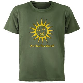
Global Warming T-shirt


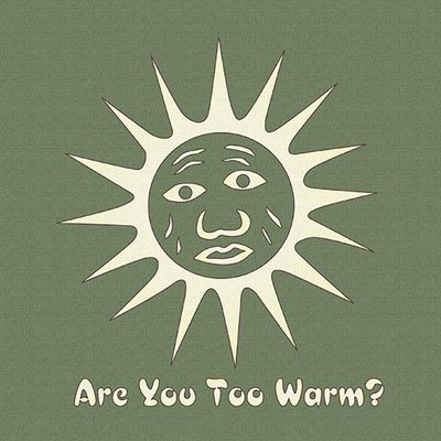
This is my new design at my Cafepress shop, WRW Color by Design. I thought of the idea when I was wondering about buying a cute little batik stamp with a sun design on it, but at first I didn't think I'd use a worried sun. (Batik stamps are amazing — every expression you can imagine is on a sun face.) And then I thought, "What would a sun be worried about?"

This is a drawing rather than using a scan of the actual copper tjap, like I've done before. I did it in a brighter yellow and orange color, which works on white tees too, and light colors like the organic tee. But I like the lighter color too, which looks more like batik on the darker tees, like this green.


Long ago I was an Oceanography major. The idea of a few degrees warmer temperatures in the oceans sounds minimal and is catastrophic. Plankton, which are the basis of most food chains in the sea, live at specific temperatures. They can't migrate.

Warmer water holds less oxygen for fish & invertebrates to use. Stopping the sinking of cold, oxygen-rich water around Antarctica doesn't just mean stopping the climate conveyor belt that warms Europe. It means those deep seafloor waters have less oxygen. And it stops the upwelling of cold nutrient-rich water off South America that used to support major fisheries. Fisheries are already crashing all over the world, mostly from overfishing.* This won't help.

*And penguins are starving both from lack of fish due to overfishing (in the Falklands), and from icebergs blocking their path to the sea (in Antarctica). Warmer seas mean more icebergs breaking off. And nutrient-poor water means less plankton and even fewer fish.

No wonder the sun is worried.

Labels: , , , , ,

Sunday, January 07, 2007

Heraldic Design as Inspiration for Fabric Design


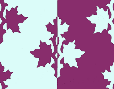
These are two papercut designs I did in the design class 2 years ago. The first was a counterchange assignment, and I love the way this floral lays out in an alternating stripe when it is repeated. Naturally for me, both designs turned out as fabric designs.

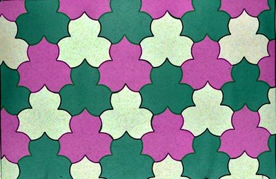
The second design was for a tessellation assignment, and since I am familiar with quilt-style tessellations, I wanted to do something more difficult than a standard based-on-a-square pattern. I also wanted to do something that looked floral, so I was happy with this trillium effect. After I turned this in I realized that by dividing the patches, I could have leaves & butterflies too, with this layout.

This second pattern is less obviously related to heraldic design, but heraldry uses tessellations in the "vair" and other fur designs. Counterchange is, of course, a common design effect in heraldry, one which is very effective. When I suggest heraldry as an inspiration for fabric and other surface designs, I mean not the heraldic lions or unicorns, (unless used as repeating patterns, which can be fun), but more that looking at some of the design strategies, like field divisions and counterchange, can be a rewarding source of inspiration.


Labels: ,

Monday, January 01, 2007

The fatal law of gravity


When you're down, everything falls on you.

Labels: ,

Sunday, December 10, 2006

New logo & Color 101 part 1: RGB & CMY


You are in a dark room. A beam of light reaches out to the white wall. It's green! Then another. It's blue! And where they overlap, twice as much light, twice as bright, and the color is called cyan. Sort of sky color. It's usually called turquoise in fabric dyes. Then another beam of light . Red! And it moves until it overlaps too. Where it overlaps the blue light, brighter than either, is a sort of purple-pink. You can see that it's a mix of blue and red. That color is called magenta in lights and printing inks, and usually fuschia in fabric dyes. Where the red overlaps the green light beam, twice as bright, is yellow. Sun color.

And in the center, where all the lights overlap, is white. The sum of all the 3 beams, Red, Green & Blue. Or the sum of any 2 opposites. Red light plus cyan light. Green light plus magenta light. Blue light plus yellow light. The sum of two complimentary lights is white light. The primary colors of light are Red, Green and Blue. The secondary colors (made by mixing 2 primaries) of light are Cyan, Magenta and Yellow. Those are also the primary colors of printing inks in the CMYK system, along with Black (K). The primaries of fabric dyes, equivalent to cyan, magenta, & yellow, are Turquoise, Fuschia, and Yellow. And in fabric dye, unlike inks, black is a mix of several colors.***

"But, but, but… That doesn't have anything to do with real life, does it? That's just an arbitrary system; It's only for computer screens, isn't it?" and "But, but, but… That isn't the color wheel we were taught in school! That can't be right. Blue wasn't opposite to yellow, was it? I'm sure red is opposite to green, not that funny magenta color. And where did that other blue come from? I'm sure red was opposite to green!" and, quietly, plaintively, "Why is the green so much brighter than the red and blue?" and maybe "Where's orange?" or "Why isn't there any real purple?"

This is the first of many posts about color. And I know I don't know everything, or even most things, about the subject. But to begin to address those questions — my first introduction to RGB color was in a classroom, with the scene described above. The Photomicrography teacher was shining colored lights at the wall. And when you see the light beams overlapping, and making those brighter colors, and then white, you have to start by admitting that this is real. This is the way the colors of light work.*

For years I thought of this as only an alternate color system, along with that system that was taught in school, with red, yellow & blue as the primaries, green, orange & purple as the secondaries. The paint-mixing color wheel. The "artists" color wheel. Because everyone was so dogmatic about how that was the "real" color wheel.

I made a color wheel based on the primaries of light, and used it for cross-stitch & quilt designs, and gardening. Because, if you compare them, you will see that this wheel expands the blue-to-green portion, and decreases the orange part. And first, I preferred it that way. And second, for garden designs, it seemed appropriate to expand the sky & leaves part of the wheel. But I was still thinking of this as just an alternate choice.

Then, I was working in a bookstore. And there are at least 2 books** out on color, from art house publishers, for artists, in which the writer is jumping up and down and waving his hands and shouting "Hey look eveybody! Look you guys! Look what I've found out! If you mix your paints starting with yellow, cyan & magenta instead of yellow, blue & red, as primary colors, you'll get much brighter colors!" As far as art education goes, or new books written on color, for quilters perhaps, this has mostly been ignored. But if you happen to take a college art course, and there happens to be a color wheel on the classroom wall, you may notice that although the primary colors are still labelled Yellow, Red & Blue — Red is definitely not fire engine red any more, but has migrated towards magenta, and blue is definitely not royal any more, but much more like cyan or turquoise. Unfortunately, they haven't redone the rest of the colors. The same orange, green and purple are still the secondaries. It makes the wheel look really unbalanced. But they are pretending, by renaming things, that they were right all along.

And on the question of what is real… Our eyes have rods and cones in the retina for detecting light. Rods work better than cones in low-light conditions, and detect only light to dark, or luminosity, not color. Cones are for detecting color. There are 3 kinds, the ones that detect Red, Blue or Green. Those primary colors of lights, Red, Green & Blue, are chosen because those are the primary colors of how our eyes detect color.****

And if the Red & Green cones react with equal intensity, we see yellow. (You were wondering how red & green added up to be yellow, weren't you?) And our eyes see most strongly in the yellow-green range (new-leaf color). So we see green light of the same intensity as brighter than red or blue.

And finally, all color wheels are figments of our imaginations. Light comes in wavelengths of the visible spectrum. Isaac Newton, who first described the spectrum of visible light, after splitting white light with a prism, named the colors he saw Red, Orange, Yellow, Green, Blue, Indigo & Violet. (Indigo, a dye, is the color of classic blue jeans. So the color he called blue is undoubtedly the bright cyan band which is very visible at the edge of the greens.) He put the colors back together into white light again by sending them through another prism. And he put the colors into a circle, adding purple, and made the first color wheel. He had to add purple (or red-violet) because it doesn't exist in the visible spectrum of light. Our eyes make the "non-spectral purples" by adding together other colors of light from the two ends of the visible spectrum of light.

If you're really interested in this, do see if your local college or community college has a Color Theory course. I guarantee it will expand your universe. And I hope you get a teacher as excellent as Pat Chapin, who was teaching it at our local community college, when I took color theory several years ago. And for books, be sure to look in the physics section as well as the art section of the library.

Oh, new logo? Well I'm designing myself a website for the web design class, and I needed a logo. And doing that is what prompted me to start on this color explanation, finally.


*For photographers — you don't get the same effect by overlapping filters. Filters are taking away all but the selected color. When you overlap filters, you get only the light, if any, that isn't eliminated by either filter.

**Watson-Guptill published at least one of them, maybe both. I think one might have been about water color, one about oils. I think José Parramon might have written one of them. One of them went very thoroughly into the subject of afterimage colors, exploring just which exact shades were the visual opposites of a lot of colors. (For one set of eyes.)

***Dyes and inks are dependant on chemistry; either there is a single pigment which absorbs all wavelengths, making black, like charcoal, or there isn't. And if there isn't, like in fiber-reactive dyes, then blacks and grays are made by mixing several colors. So fiber reactive blacks will have a color cast, and color halos, as dye spreads in tie-dyeing. And if there are undissolved pigment spots, they might be red, in a grey with an overall greenish cast.

****Yes, psychological color has four primaries; red, green, blue & yellow. I'll study up on that, and see if I can explain it later. And no, not everybody's cones are the same. We don't all see the same red. More later.

Labels: ,

Monday, November 27, 2006

I wore this every day for a year


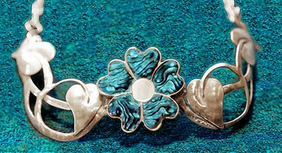
Well, nearly everyday. I made it in a jewelry class. Every Saturday morning I'd drive down to Rocklin for an all morning class. I'd work out in the garage every night after work, until by about Thursday I'd get stuck, at a point where I didn't know how to go on. Then on Saturday morning, the teacher (Nancy Foster, a truly excellent teacher) would set me on the path again. It took about a month.

I loved it and it went with almost all my clothes. Well, I chose clothes to set it off. But it was designed to go in an open-necked shirt. That's why the chain around the back. It sat up off my neck, and felt very light. It was very comfortable to wear.

But it had a design flaw; the narrow point right next to the flower was too narrow, and bent too easily. Someday it would break. I stopped wearing it every day, and kept it for special occasions, to extend its life.

Then a few years ago it was stolen. I'm sure that whoever bought it at a flea market from the drug-addict/alcoholic thief didn't know, although perhaps one could guess about a purchase from such a source. Anyway, it probably broke the first time someone tried to wear it.

There's no chance I could make one again. Well, it had a short life, but it was loved more than most pieces of jewelry, probably.

Labels: , , ,

Tuesday, November 21, 2006

Baby Sea Turtles virtual batik


This is a new design I just finished. Virtual batik, which I think I invented, is based on a real copper batik stamp. I scan it, in a darkened room with the cover up, to get a dark background. Then it goes into Photoshop for some playing with color to get nice bright light colors, that will shine against a dark background, like real batik. In this case, the design is meant for the new dark colored tees that Cafepress has just added. Some colors, like this one, look brighter on the web than they will in print. Others, like the gold, proof pretty bright, so they might print that way on tees too.

It was only while I was working on this, making about a dozen colors, that I realized how appropriate it is for a crawling age baby. But of course any sea turtle friend should also like them. The other colors are coming, I only have two up so far, at WRW Color by Design. Next I have to do the mama sea turtles. Since I don't have an adult sea turtle stamp, that will be a little trickier… Photoshop here I come.

Labels: , , ,

Saturday, November 18, 2006

That doesn't look like banana bread


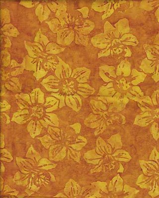
But it's just as delicious. It's another gorgeous batik fabric design. Not my color, but beautifully designed. It's one of a small but growing group of fabrics called "If I were going to do a clothing line, these are the type of fabrics I'd use".

The banana bread reference is because I didn't have a picture of banana bread (and wasn't about to not have a hot-out-of-the-oven taste in order to set up a photo). So this fabric is at least golden brown, and reminiscent of banana bread. And the real title of this post is I baked the first banana bread of the year today, hooray

"What", you say, "is the big deal about that? You can bake banana bread at any time." Well, not this kind. This is my very special, extremely tasty cranberry banana bread. It's also one of the few endeavors known to woman which are improved by procrastination…

It turns out that it's very important to the flavor that the bananas be very ripe, over-ripe, even somewhat brown. So if I have three bananas getting pretty ripe, and I save them for baking, waiting a few days doesn't hurt. The other things that make this bread more tasty than the standard are that half of the sugar is brown sugar, half of the flour is unbleached white and the other half is stone-ground whole wheat. Another time I'll tell the stories about how I know the types of flour taste different.

The cranberries are fresh cranberries, sorted very carefully so they are all hard and perfect with no soft spots. The bread is especially good the first day, while there is still a contrast between the tartness of the cranberries and the sweet banana bread. After the second day, the sweetness has osmosed into the cranberries. It's still good, but doesn't have the contrast.

Mina's Cranberry-Banana Bread

mash together:
3 very ripe bananas
1/2 c brown sugar
1/2 c white sugar

stir in:
1 egg

premix & stir in
3/4 c stone-ground whole wheat flour
3/4 c unbleached white flour
1 t baking soda
1 t salt (scant teaspoon)

stir in gently:
1 c very carefully sorted hard perfect fresh cranberries, washed

Pour into a buttered loaf pan. (I use the glass type.) Bake approximately 1 hour at 325℉, until top is golden brown & toothpick comes out clean. If top is getting too dark, cover with foil for the last 15 minutes.

It is especially good hot with butter, or toasted for breakfast. (You might have noticed that there is no butter in it. That's correct. I used to put in melted butter, but then one day I forgot it while it was cooling a little, and left it out. I couldn't detect any difference in taste or texture, and the bananas keep the bread moist, so I haven't used it since.)

Try it out and let me know what you think.

Labels: , , ,

Thursday, November 16, 2006

Quoth the Raven, "Nevermore"


While I was walking down the hill from school last week or so, I heard a musical, liquid chuckling noise from behind and above me; the noise perhaps that is described as like molasses gurgling out of a jug. I looked back, and there was a raven sitting on the lamppost I had just walked under. It was a most unexpected noise from that source, though maybe I had read about it and forgotten. I tried to take a picture, though none came out well enough to use, but they did show clearly enough the shape of the bill and the curve of the throat feathers, so I could be sure it was a raven. And when it flew, the angle of the tail confirmed it.

I had learnt those details about ravens while researching to do these drawings of them for a class last spring. At that time, I had not seen any close by, but they've been in the yard since, sitting in the trees quite close to the window. Still no pictures — they fly away when I open the window to try. They're too smart for me.

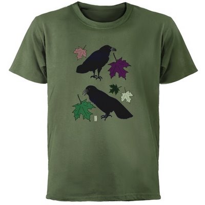
When Cafepress brought out these new colorful tees, and I started putting my designs on them, the ravens came to mind. I had not originally put any ravens on kids tees, thinking "Who'd want to put pictures of ravens on their kids?" Then I thought about Poe's raven, who said "Nevermore", and it reminded me of a 2-year-old who has just discovered the power of saying "No".

(In an "ontogeny recapitulates phylogeny' sort of cultural evolution, that seems to be similar to the power discovered by the medieval Arabic mathemeticians who discovered the concept of zero.)

And it seemed to me that having the raven to symbolize that eternal No might be funny. (My little niece is just two, so I am thinking about this.)


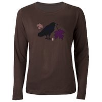
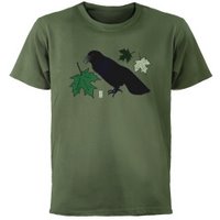
And then I thought about the holiday curmudgeon type of family member, who might appreciate a raven t-shirt as camouflage and defense against, and comment on, the seasonal festivities. These new dark tees are perfect for that, especially this green. The Fall-colored raven drawing looks almost cheerful on the new women's brown tee. Especially in comparison to the almost sinister look of the Spring-colored raven with the green leaves on the green tee.

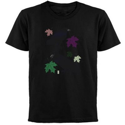
And I'm still wondering, since I haven't ordered one to try it out, if the rather blue-black raven feathers would show in an interesting way against the black tee. Perhaps people who would like that would prefer that there not be any of those confounded colorful leaves to interrupt their black gloom. I might have to try a version of that.

Labels: , , ,