Wednesday, November 29, 2006

Another Cafepress print comparison


After Cafepress' recent announcement that Value tees will now only be heat transfer, I was reminded to publish another comparison of the results of the printing methods. This design, which I have shown before, I had printed both ways. The heat transfer, on the right, is brighter and clearer, and in this case, pretty true to the origninal colors, which can be seen at http://www.cafepress.com/wrwcolors/1263976.


I'm just disappointed because I had been experimenting with overdyeing my Cafepress direct print tees, and it was being fun and successful, and I liked value tees for it. I'm not sure yet if the technique will work for heat transfer.

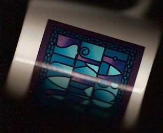
Here is the image on a mug. I just put it on the scanner, then played with the colors a little in Photoshop to get them to look as close to the mug in my hand as I could. As with other images, it comes out bluer and darker on the mug. I have a lighter version I did for the black tee, so I'm going to switch images, I think.

Labels: ,

Monday, November 27, 2006

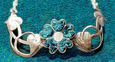
I wore this every day for a year


Well, nearly everyday. I made it in a jewelry class. Every Saturday morning I'd drive down to Rocklin for an all morning class. I'd work out in the garage every night after work, until by about Thursday I'd get stuck, at a point where I didn't know how to go on. Then on Saturday morning, the teacher (Nancy Foster, a truly excellent teacher) would set me on the path again. It took about a month.

I loved it and it went with almost all my clothes. Well, I chose clothes to set it off. But it was designed to go in an open-necked shirt. That's why the chain around the back. It sat up off my neck, and felt very light. It was very comfortable to wear.

But it had a design flaw; the narrow point right next to the flower was too narrow, and bent too easily. Someday it would break. I stopped wearing it every day, and kept it for special occasions, to extend its life.

Then a few years ago it was stolen. I'm sure that whoever bought it at a flea market from the drug-addict/alcoholic thief didn't know, although perhaps one could guess about a purchase from such a source. Anyway, it probably broke the first time someone tried to wear it.

There's no chance I could make one again. Well, it had a short life, but it was loved more than most pieces of jewelry, probably.

Labels: , , ,

Tuesday, November 21, 2006

Baby Sea Turtles virtual batik


This is a new design I just finished. Virtual batik, which I think I invented, is based on a real copper batik stamp. I scan it, in a darkened room with the cover up, to get a dark background. Then it goes into Photoshop for some playing with color to get nice bright light colors, that will shine against a dark background, like real batik. In this case, the design is meant for the new dark colored tees that Cafepress has just added. Some colors, like this one, look brighter on the web than they will in print. Others, like the gold, proof pretty bright, so they might print that way on tees too.

It was only while I was working on this, making about a dozen colors, that I realized how appropriate it is for a crawling age baby. But of course any sea turtle friend should also like them. The other colors are coming, I only have two up so far, at WRW Color by Design. Next I have to do the mama sea turtles. Since I don't have an adult sea turtle stamp, that will be a little trickier… Photoshop here I come.

Labels: , , ,

Saturday, November 18, 2006

That doesn't look like banana bread


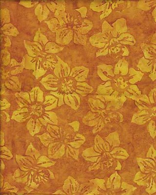
But it's just as delicious. It's another gorgeous batik fabric design. Not my color, but beautifully designed. It's one of a small but growing group of fabrics called "If I were going to do a clothing line, these are the type of fabrics I'd use".

The banana bread reference is because I didn't have a picture of banana bread (and wasn't about to not have a hot-out-of-the-oven taste in order to set up a photo). So this fabric is at least golden brown, and reminiscent of banana bread. And the real title of this post is I baked the first banana bread of the year today, hooray

"What", you say, "is the big deal about that? You can bake banana bread at any time." Well, not this kind. This is my very special, extremely tasty cranberry banana bread. It's also one of the few endeavors known to woman which are improved by procrastination…

It turns out that it's very important to the flavor that the bananas be very ripe, over-ripe, even somewhat brown. So if I have three bananas getting pretty ripe, and I save them for baking, waiting a few days doesn't hurt. The other things that make this bread more tasty than the standard are that half of the sugar is brown sugar, half of the flour is unbleached white and the other half is stone-ground whole wheat. Another time I'll tell the stories about how I know the types of flour taste different.

The cranberries are fresh cranberries, sorted very carefully so they are all hard and perfect with no soft spots. The bread is especially good the first day, while there is still a contrast between the tartness of the cranberries and the sweet banana bread. After the second day, the sweetness has osmosed into the cranberries. It's still good, but doesn't have the contrast.

Mina's Cranberry-Banana Bread

mash together:
3 very ripe bananas
1/2 c brown sugar
1/2 c white sugar

stir in:
1 egg

premix & stir in
3/4 c stone-ground whole wheat flour
3/4 c unbleached white flour
1 t baking soda
1 t salt (scant teaspoon)

stir in gently:
1 c very carefully sorted hard perfect fresh cranberries, washed

Pour into a buttered loaf pan. (I use the glass type.) Bake approximately 1 hour at 325℉, until top is golden brown & toothpick comes out clean. If top is getting too dark, cover with foil for the last 15 minutes.

It is especially good hot with butter, or toasted for breakfast. (You might have noticed that there is no butter in it. That's correct. I used to put in melted butter, but then one day I forgot it while it was cooling a little, and left it out. I couldn't detect any difference in taste or texture, and the bananas keep the bread moist, so I haven't used it since.)

Try it out and let me know what you think.

Labels: , , ,

Thursday, November 16, 2006

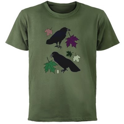
Quoth the Raven, "Nevermore"


While I was walking down the hill from school last week or so, I heard a musical, liquid chuckling noise from behind and above me; the noise perhaps that is described as like molasses gurgling out of a jug. I looked back, and there was a raven sitting on the lamppost I had just walked under. It was a most unexpected noise from that source, though maybe I had read about it and forgotten. I tried to take a picture, though none came out well enough to use, but they did show clearly enough the shape of the bill and the curve of the throat feathers, so I could be sure it was a raven. And when it flew, the angle of the tail confirmed it.

I had learnt those details about ravens while researching to do these drawings of them for a class last spring. At that time, I had not seen any close by, but they've been in the yard since, sitting in the trees quite close to the window. Still no pictures — they fly away when I open the window to try. They're too smart for me.

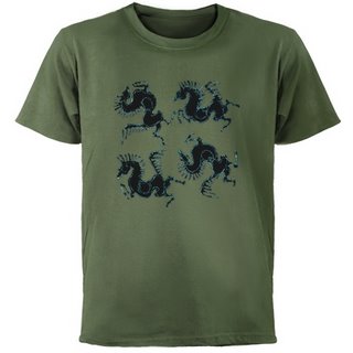
When Cafepress brought out these new colorful tees, and I started putting my designs on them, the ravens came to mind. I had not originally put any ravens on kids tees, thinking "Who'd want to put pictures of ravens on their kids?" Then I thought about Poe's raven, who said "Nevermore", and it reminded me of a 2-year-old who has just discovered the power of saying "No".

(In an "ontogeny recapitulates phylogeny' sort of cultural evolution, that seems to be similar to the power discovered by the medieval Arabic mathemeticians who discovered the concept of zero.)

And it seemed to me that having the raven to symbolize that eternal No might be funny. (My little niece is just two, so I am thinking about this.)


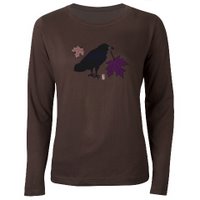
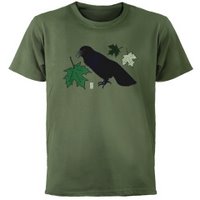
And then I thought about the holiday curmudgeon type of family member, who might appreciate a raven t-shirt as camouflage and defense against, and comment on, the seasonal festivities. These new dark tees are perfect for that, especially this green. The Fall-colored raven drawing looks almost cheerful on the new women's brown tee. Especially in comparison to the almost sinister look of the Spring-colored raven with the green leaves on the green tee.

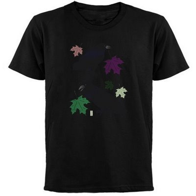
And I'm still wondering, since I haven't ordered one to try it out, if the rather blue-black raven feathers would show in an interesting way against the black tee. Perhaps people who would like that would prefer that there not be any of those confounded colorful leaves to interrupt their black gloom. I might have to try a version of that.

Labels: , , ,

Tuesday, November 14, 2006

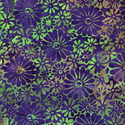
Fabric Design Inspirations 1


This is a batik fabric which may still be currently available, by Princess Mirah. The colors are interesting and unusual, though, typically, there are more similar combinations available right now. I'd certainly want to find any necessary coordinating fabrics now. I've just been trying to find "go with" fabrics for my stash, to make some lined-reversible dresses and skirts and wrap tops, and it's almost impossible to find any thing to work with fabrics from years ago. It's not just that the fashionable colors are different, the types of colors, the total palettes, are incompatible. Blued colors from one year, with a red cast from another. And worst, some years the colors are really grayed, some really bright, and they swear at each other. That is, they bring out the worst in each other.

But that's beside the point of what I wanted to say about this fabric, which is to point out the clever design. The use of both positive and negative as design elements especially. I mean the way some of the flower shapes are in the pattern color, and some in the background (whichever that is). This is an idea I want to remember.

Labels: ,

Friday, November 10, 2006

If you would make it, I would buy it & dye it

This is a copy of a letter I just sent to Dharma Trading, my favorite dye supply house for all the dyeable clothing they have. It's wonderful to have clothing available that I can have in any of my favorite colors, just by dyeing it. (Of course, I've spent half-a-dozen years working out recipes for those favorites.) I like several of their dresses, skirts, and shirts, but there are some favorite styles they don't carry.


Dear Dharma folks — I have been meaning to write you with some style requests for years. Now some of the styles I wanted are everywhere this year, and if I had written you, who knows, you might have already had them. Two things I especially wanted are full-length wrap or surplice dresses, and empire-waist tie-back dresses with flared skirts. (Also a full-length princess dress like the one you have.) Set-in or cut-on kimono sleeves. Ankle-length at least after shrinkage, with a minimum hem circumference of 120 inches or so. And please include long-sleeve versions for dressy winter dresses.

And plus sizes of course. Especially the empire-waist with flared skirts. That is the most flattering style of all time on women of ample construction. I noticed that a long time ago, when I was very slender waisted, and loaned a costume to a woman much larger, who looked fantastic in it. The flared skirts make or break the design. Do you remember granny dresses from the late 60s? They were empire-waisted but straight-cut, and had that classic sack-of-potatoes-tied-with-a-string look.

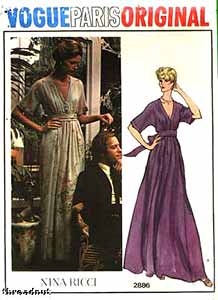
The Vogue pattern picture (top of page) is of a vintage pattern, not current, unfortunately. It seems that the waist is at the waist in the photo, but in the drawing, the altered proportions make it more like an empire waist. Notice how the drawing makes the skirt even more flared (besides the taller-&-thinner-than-human thing). They always seem to make the skirts more flared in the pictures, to make the dress look better. I say, why not cut the dress for real like that in the first place?

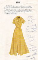
Do you collect old Peterman catalogs? I have a stack of them in my style notebook, with pages marked. Those classic styles keep reappearing. Here's a scan of one, a surplice waist long dress. I'd rather not have the front slit, but it'd be gorgeous on someone young. The advantage of a real wrap would be that it opens flat and could be dye painted or leaf-dyed, not just dyed.

The second picture is of a wrap-top I actually bought. It is my favorite thing for a dressy winter outfit in other people's warm houses. I'd like a dozen more in all my favorite dye colors.
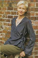


I'm in the process of making myself some new patterns, starting with commercial ones and combining & changing them, to make lined-reversible wrap and empire dresses. I plan to make them with hand-dyed and commercial batiks, to start with. If you made them, I could just buy them & dye them. Please?

Do I have a stack of white clothing already waiting? … Don't ask how big. I wanted to say, however, that your new Berkeley shirt is great. Just what I was looking for to wear to work. I'll probably be ready for another half-dozen soon. I think I might pleat the shoulder though, after dyeing.

I hope you'll email me back saying that you already have those styles in development, and didn't need this request. But now that I've started, I'll probably continue to bug you with requests. Are there any dye-able karate jackets out there?

Your very faithful and appreciative customer,
Mina Wagner

Labels: , ,

Thursday, November 09, 2006

Serendipity 1


After I made this design, the virtual batik I showed earlier, I designed a dress using it on a sage background, in the brochure for the publication design course. And now, Cafepress has surprised us with some new colors of t-shirts, and one is this green! I may have to have this…

Of course, as I go back and add designs to new colored tees, I'm finding other pictures that are great on the new colors too. Such a treat to have colors, not just white. I got so desperate for color that I'm overdyeing many of mine. I can get my favorite colors that way, but it's time consuming.


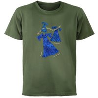
Here are some more tempting combinations that I found today. For some reason I really like the bright blue and yellow of my Dresses like Spring picture on this green. And the lilac Himalayan Poppy is perfect on this green; the leaves go with it and the flowers are contrasting colors.


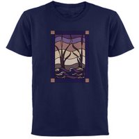
The brown tee is the new women's long sleeve tee, and the poppy works well on it. And the stained glass style Sunset Marsh design looks like it will be good on the navy color.

Labels: , , ,

Wednesday, November 08, 2006

Bob like a Lamb: the many faces of Bob part 1


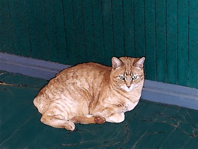
 This is Bob. He's a very picture-o-genic fellow, so there'll be lots of different versions of him in the future. This one shows the one feature of Bob that everyone notices first, and the reason for his name — no tail.

Summer a year ago, he and the neighbor's cat got into a rolling, fur-flying fight on this upstairs porch — and rolled down the stairs. They rolled off the side of the steps about halfway down, and landed on the concrete walk. Bob was on the bottom. He landed on his back. They both walked away from the landing, but Bob was staggering.

He didn't want to be picked up. He slowly walked up onto the front porch, and rested for a while. I was hanging out with him, but when I went inside for a few minutes, he vanished. When I came back out, and started calling him, the crows down the hill were making a fuss. I hadn't been calling him for 10 minutes when a coyote came trotting up through the orchard. Broad daylight, 1:00 in the afternoon. It was only after reading the book called Bird Brains that I realized the crows had been notifying the coyote of the injured animal. Ravens do it with wolves.

Bob didn't show up that day or that night, but he must have been well hidden under a bush, because the next morning there he was on the front porch, loudly demanding breakfast. Two lives in one day.

Labels:

Wednesday, November 01, 2006

Type as texture


Erin over at Dressaday posted yesterday some fabrics with font designs. They're fun, but all black & white, and the fonts aren't the most interesting.

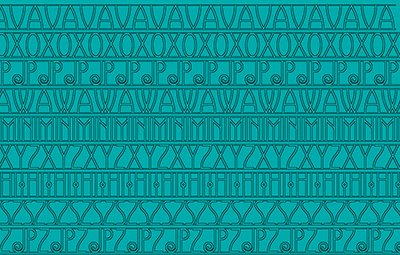
They reminded me of the designs I did with the font Avignon, by Nick Curtis. That font, based on one from the early 20th century makes beautiful textures. This is a sampler of Avignon textures. I did it in several dozen colors, and printed my favorite versions onto 8.5x11 treated fabric. The idea is to piece them into a jacket with a black lining. Most of the ones I printed had gradient backgrounds, which wouldn't work as well for yardage. I sure would love to get yardage of this design, though. It's a little reminiscent of the fine designs on shwe shwe fabric, that Erin showed a few days ago.

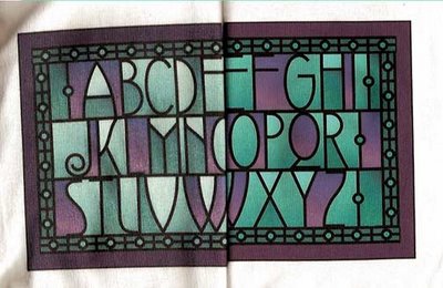
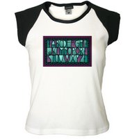
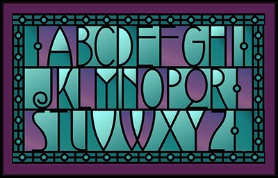
Meanwhile, I did a stained glass looking Avignon ABC design, which I put up at my Cafepress store WRW Color by Design. It's on t-shirts, kids tees, mugs.Here it is on a women's cap sleeve tee. I'll post the actual design later; it's being very slow to load images now.

Labels: